
Lucas Wheels
Chris approached me looking for a refreshed identity for his well‑established alloy business. With the brand being used across his eBay store and wider digital platforms, the goal was to create a logo that felt professional, recognisable, and aligned with the automotive market he works in.
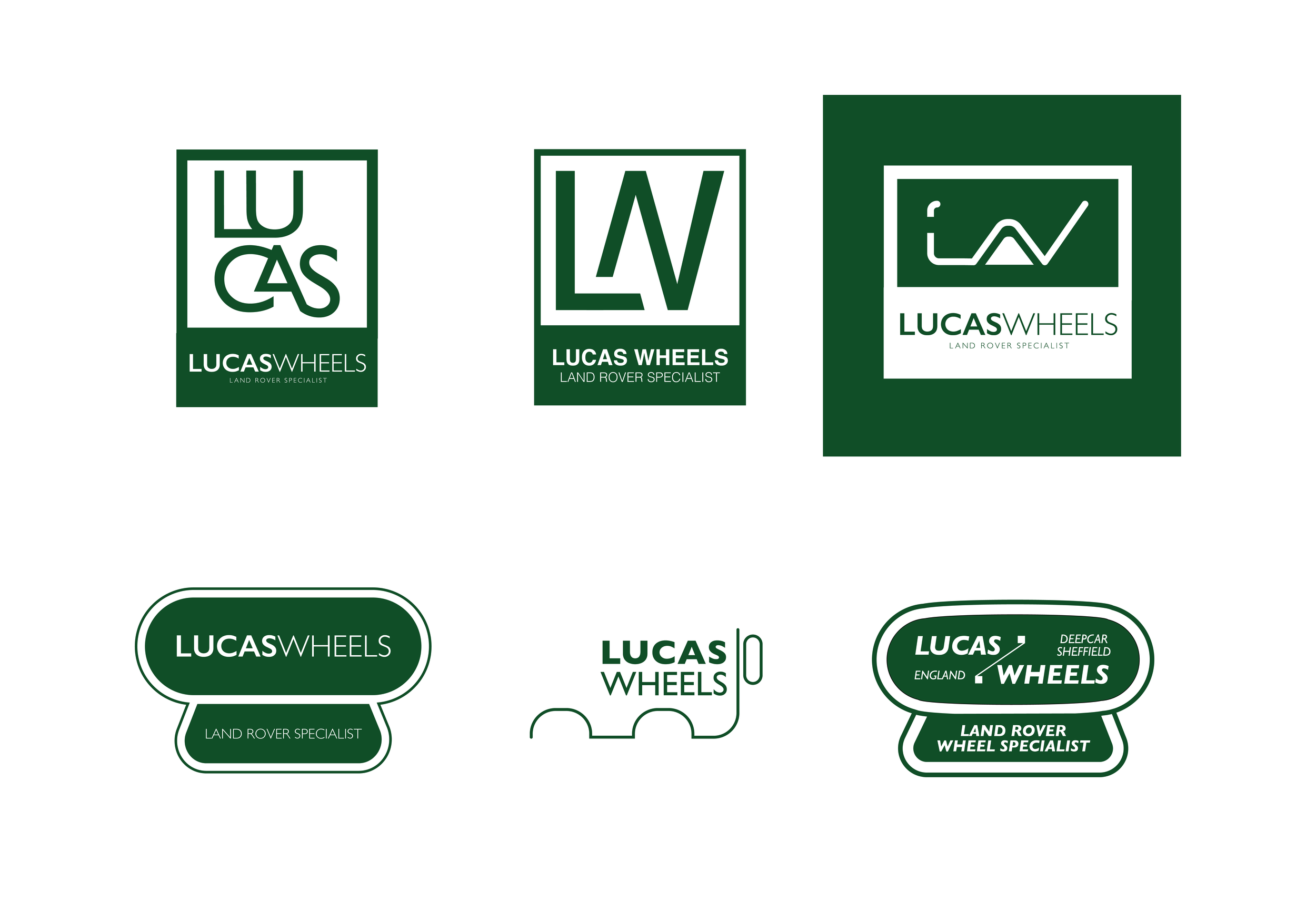
The starting point was the traditional Land Rover logo, which Chris had always gravitated towards. I began by exploring variations inspired by its classic oval form, incorporating subtle nods to earlier iterations of the brand while adapting the structure to suit his business. These early concepts focused on heritage, familiarity, and the visual language associated with long‑standing automotive brands..
As the project developed, Chris mentioned that much of his work now involves more modern vehicles. This shifted the direction slightly, leading me to introduce elements influenced by the updated Land Rover identity — cleaner lines, sharper geometry, and a more contemporary feel. This balance between traditional cues and modern refinement helped create a logo that felt rooted in automotive history while still relevant to today’s market.
Alongside these explorations, I also produced variations that stepped away from the Land Rover influence entirely. These concepts experimented with alternative shapes, typographic approaches, and visual styles, giving Chris a broader view of how the brand could evolve beyond the expected.
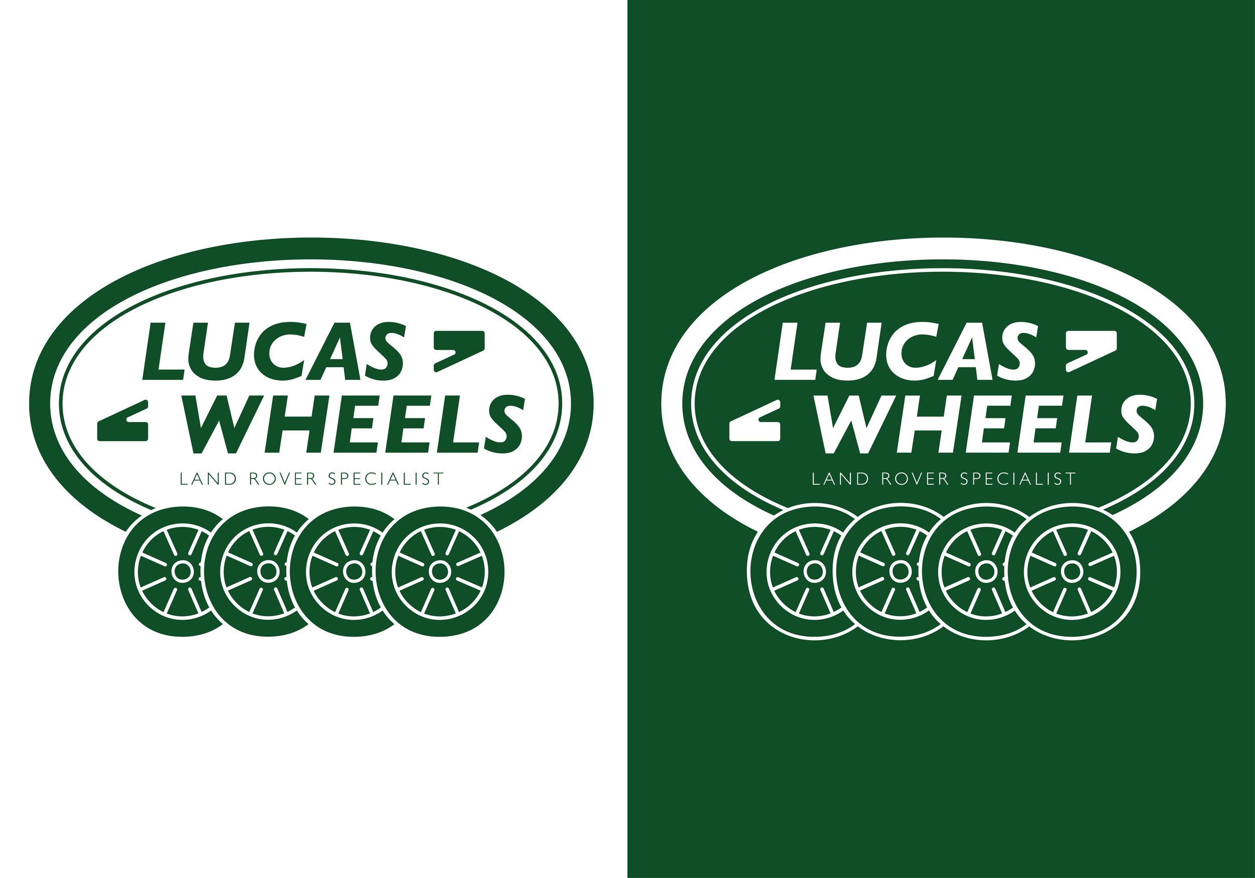
After several rounds of refinement and feedback, Chris selected the final variation — a design that captured
the professional, trustworthy character he wanted while aligning with the vehicles and customers he works
with today.