
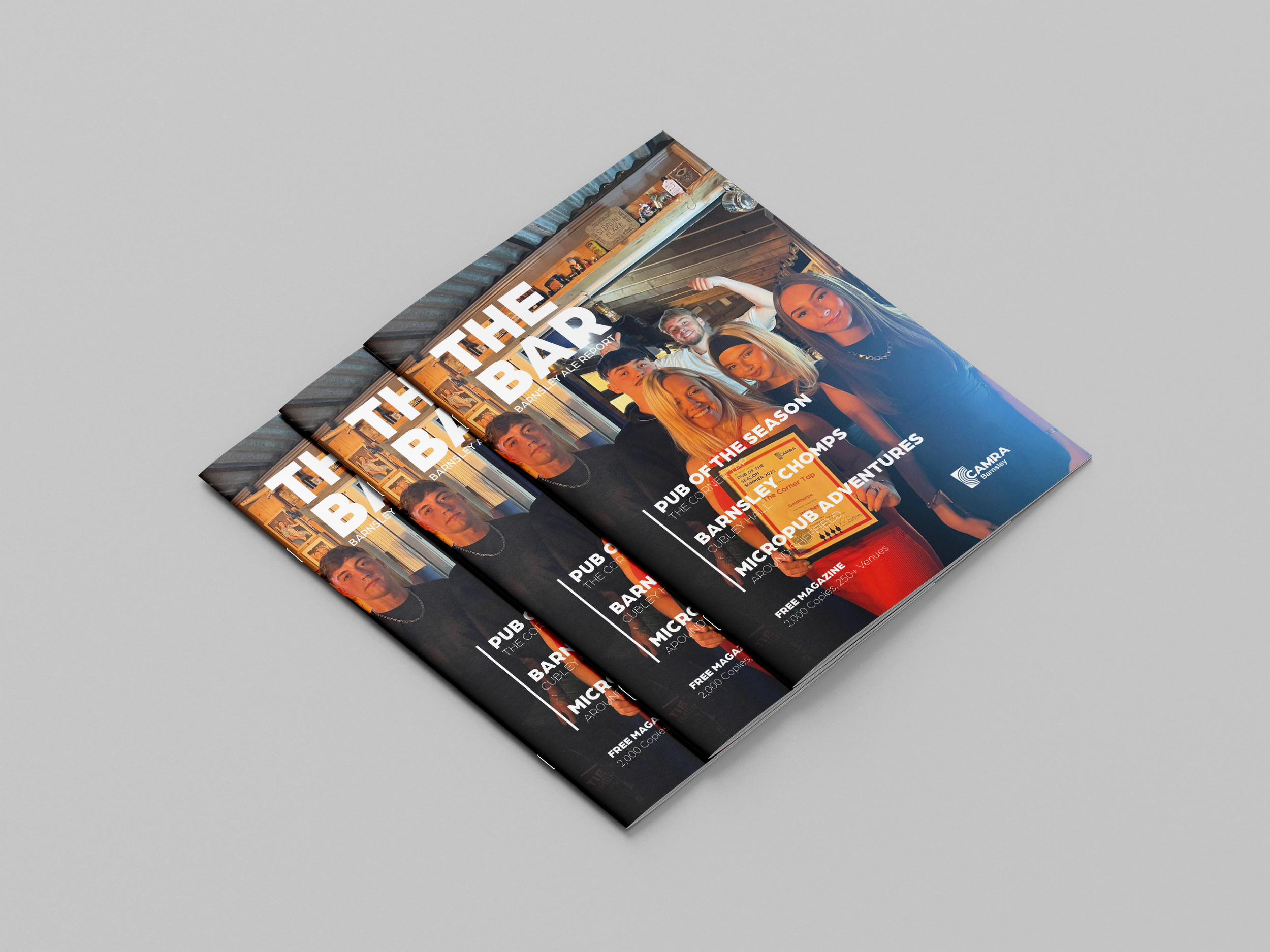
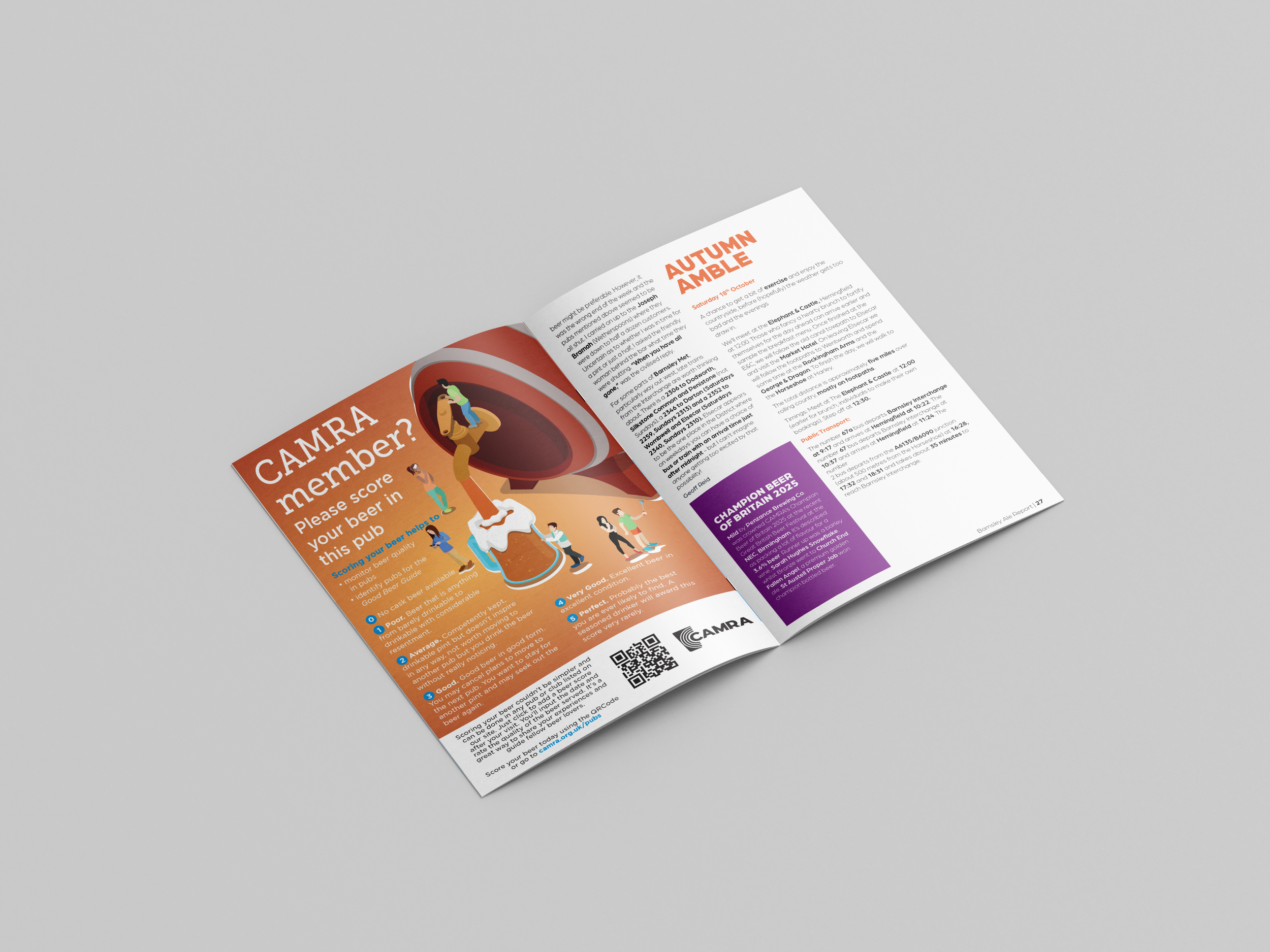
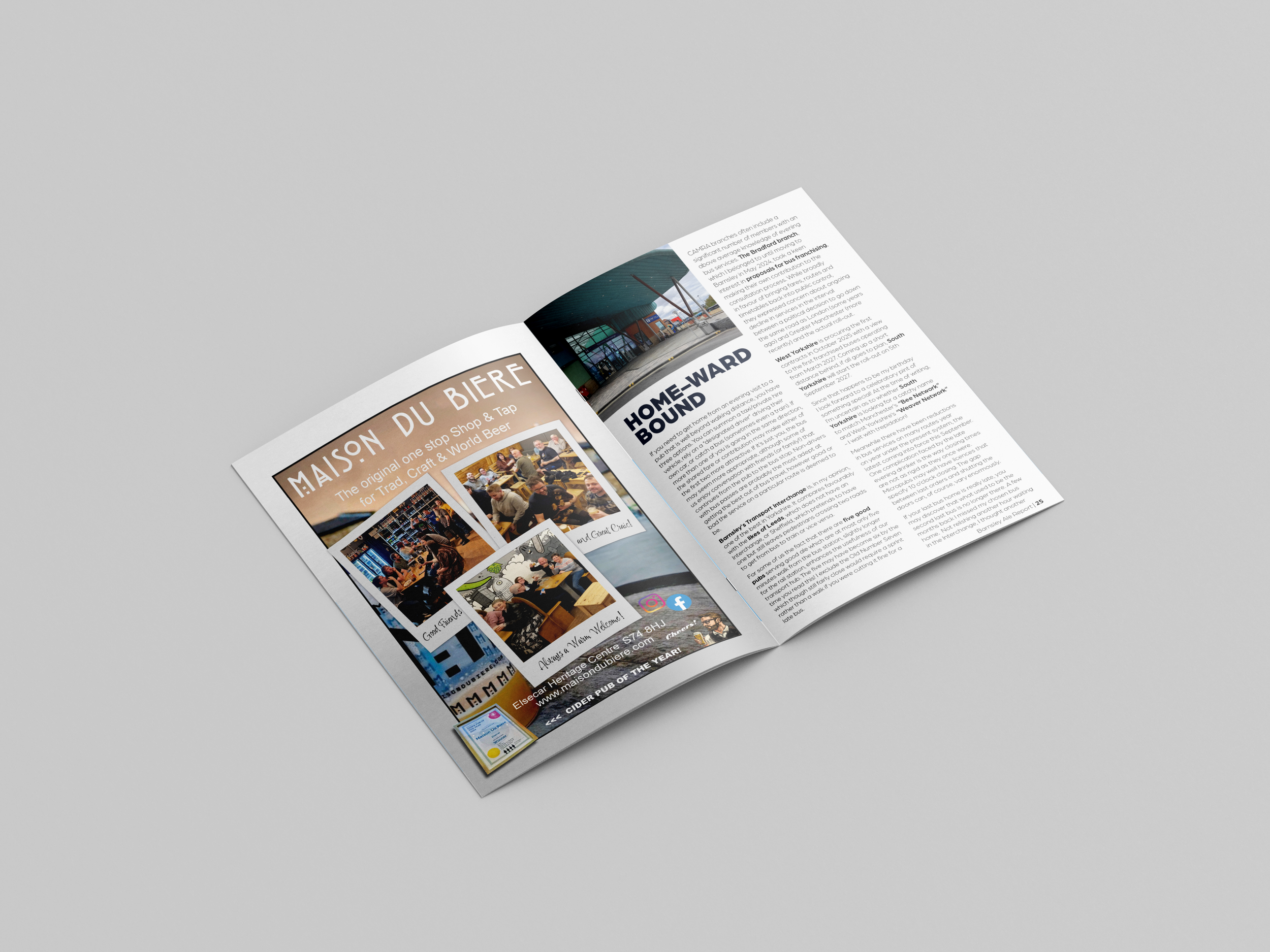
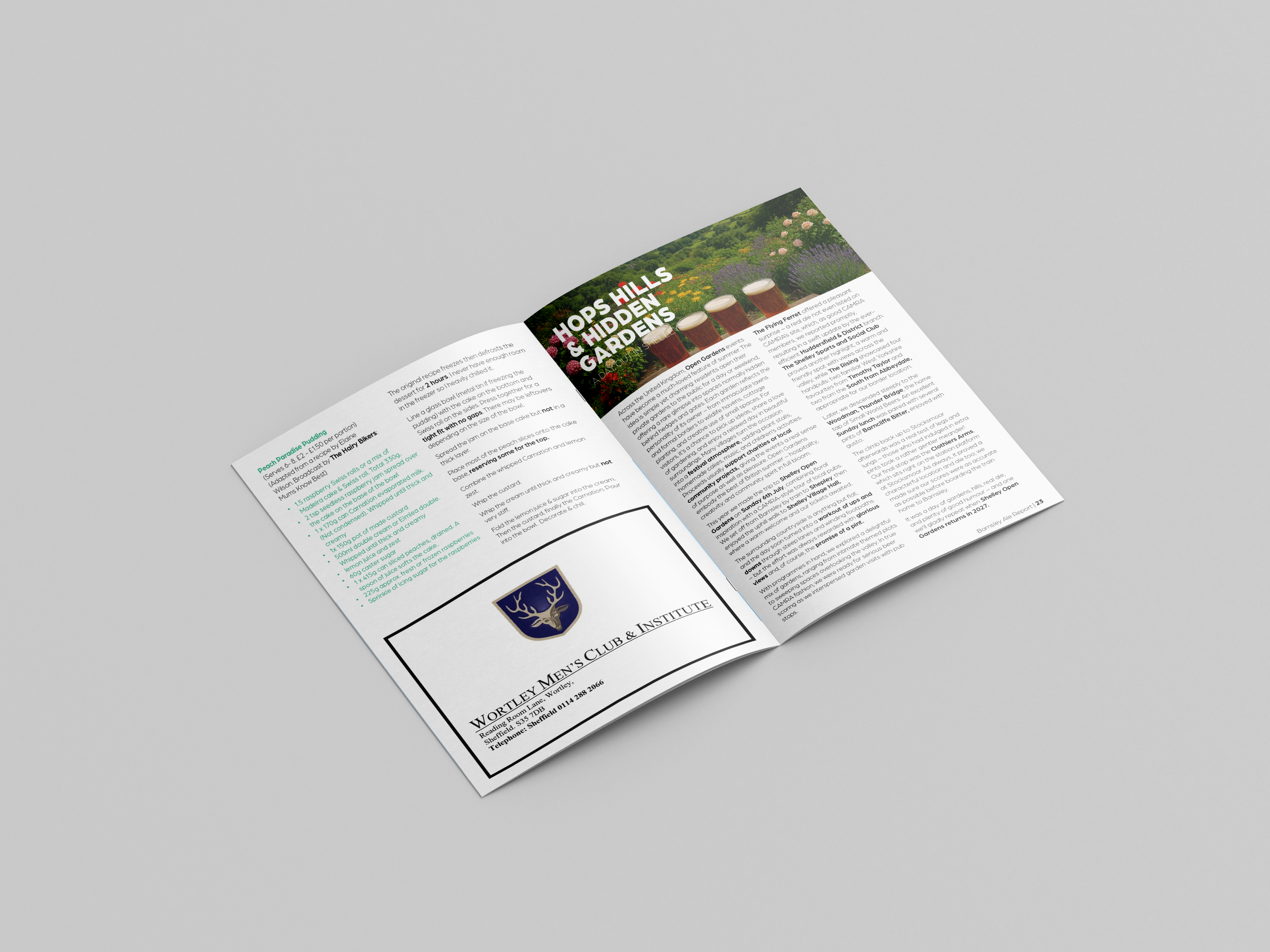
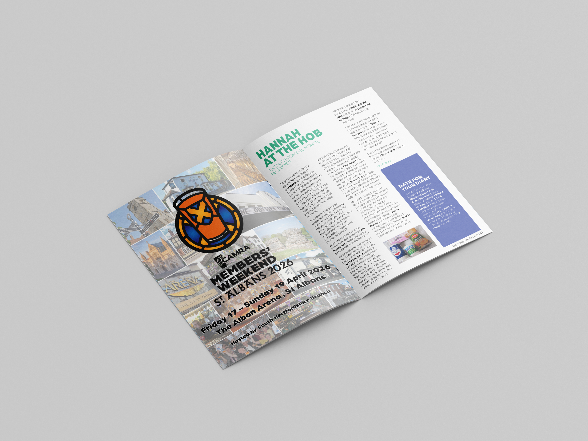
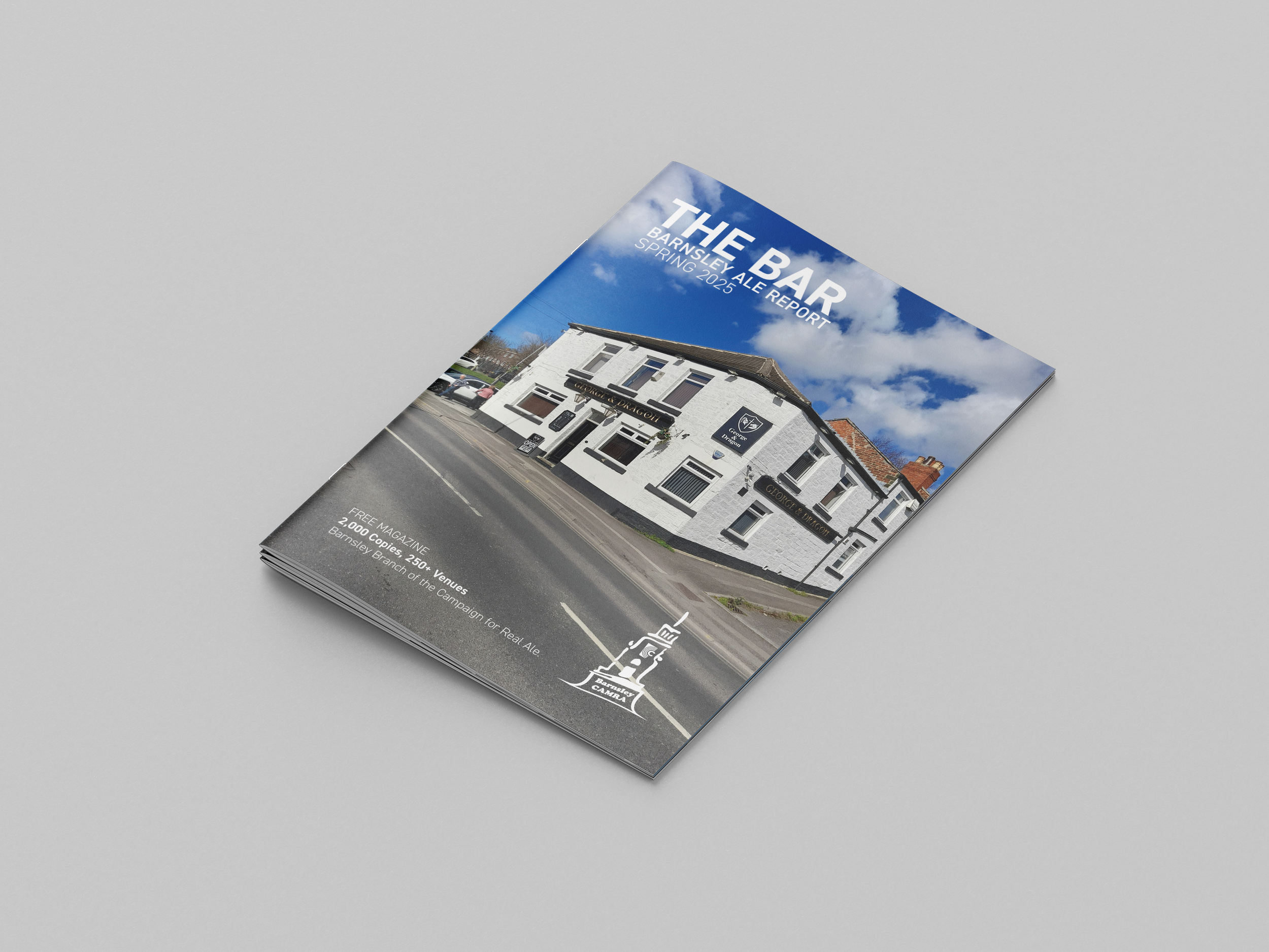
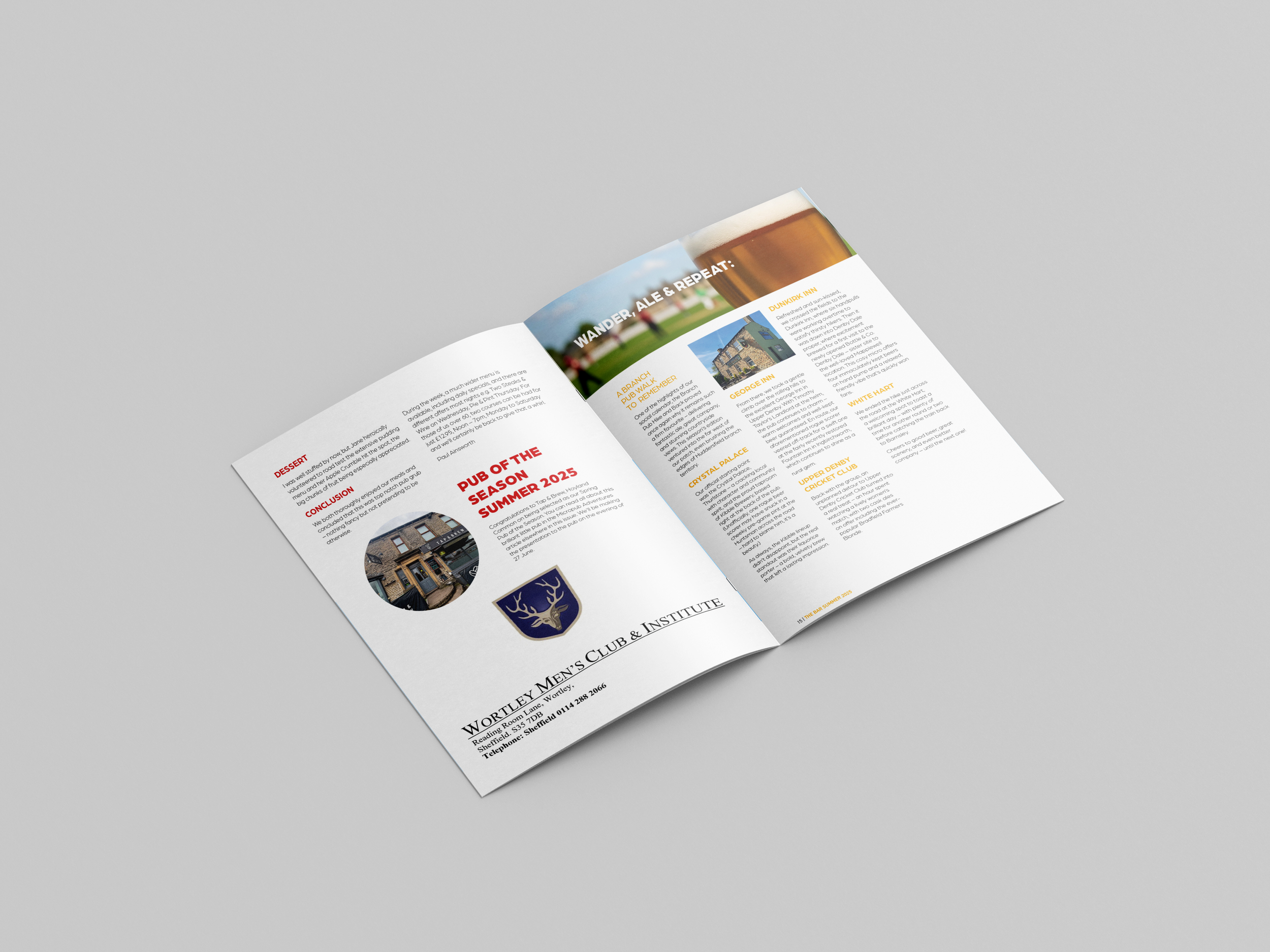
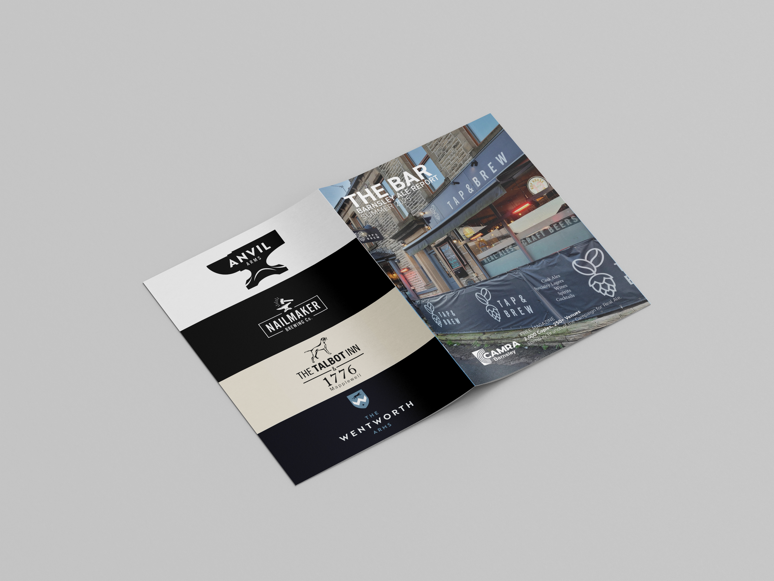
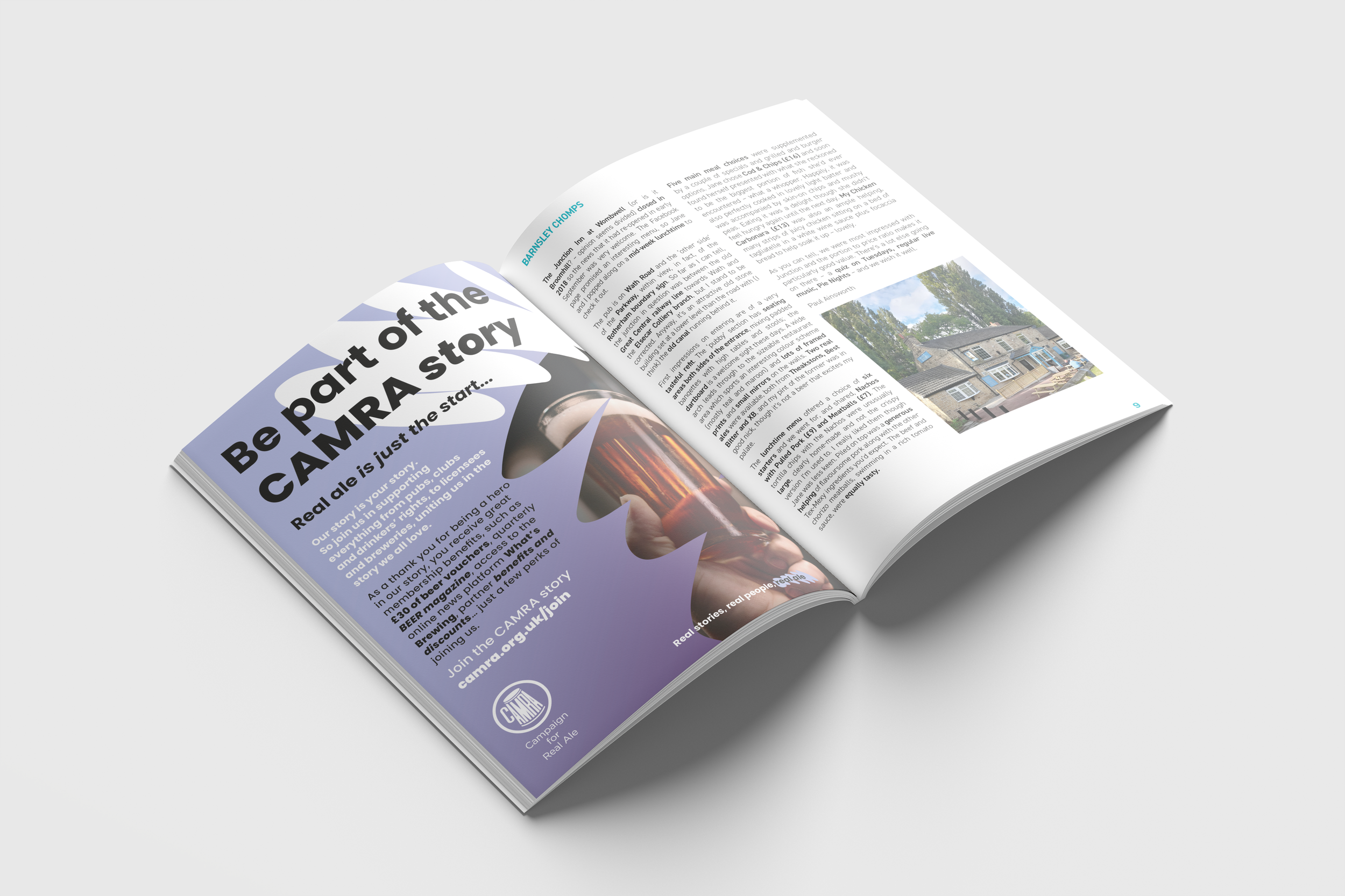
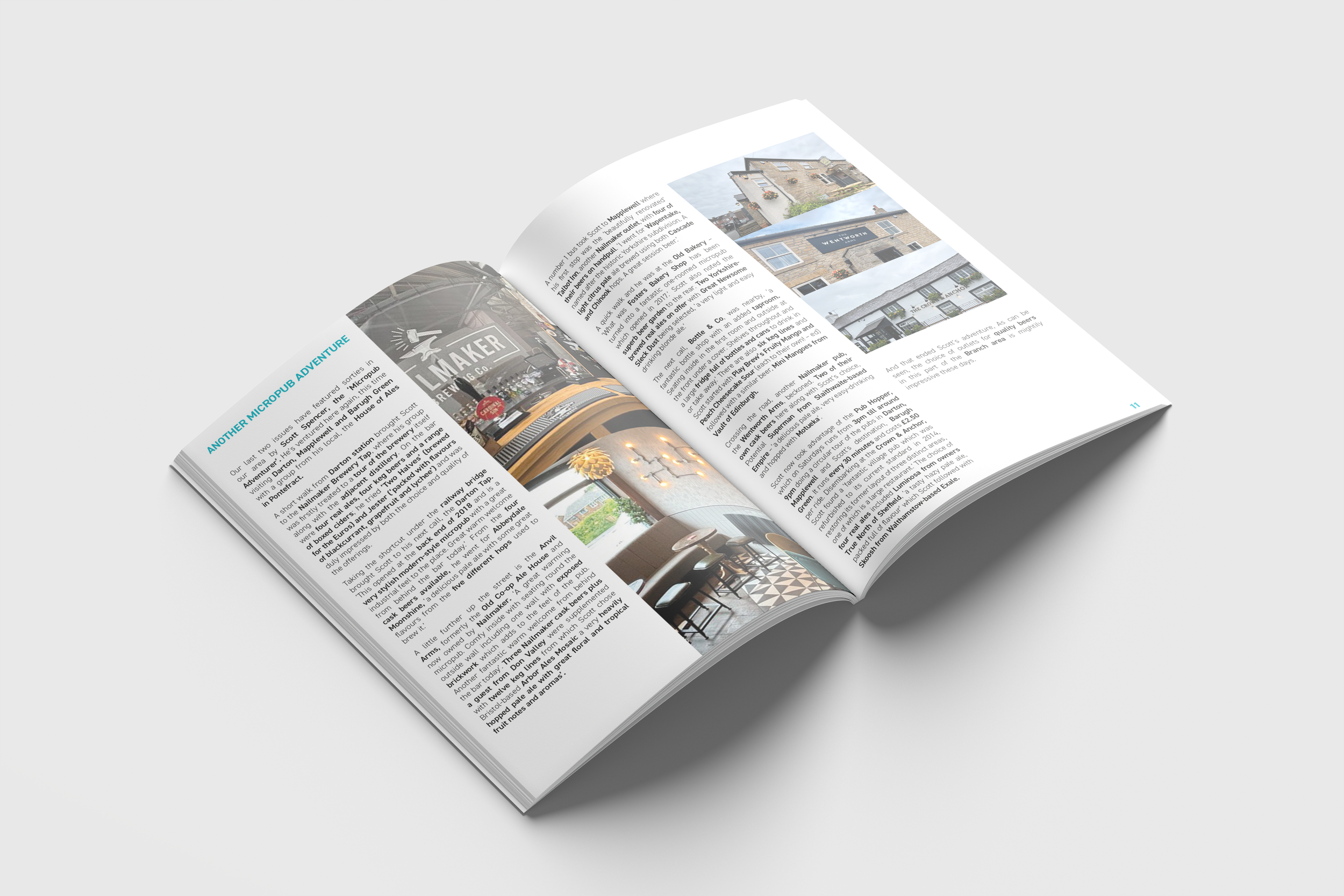
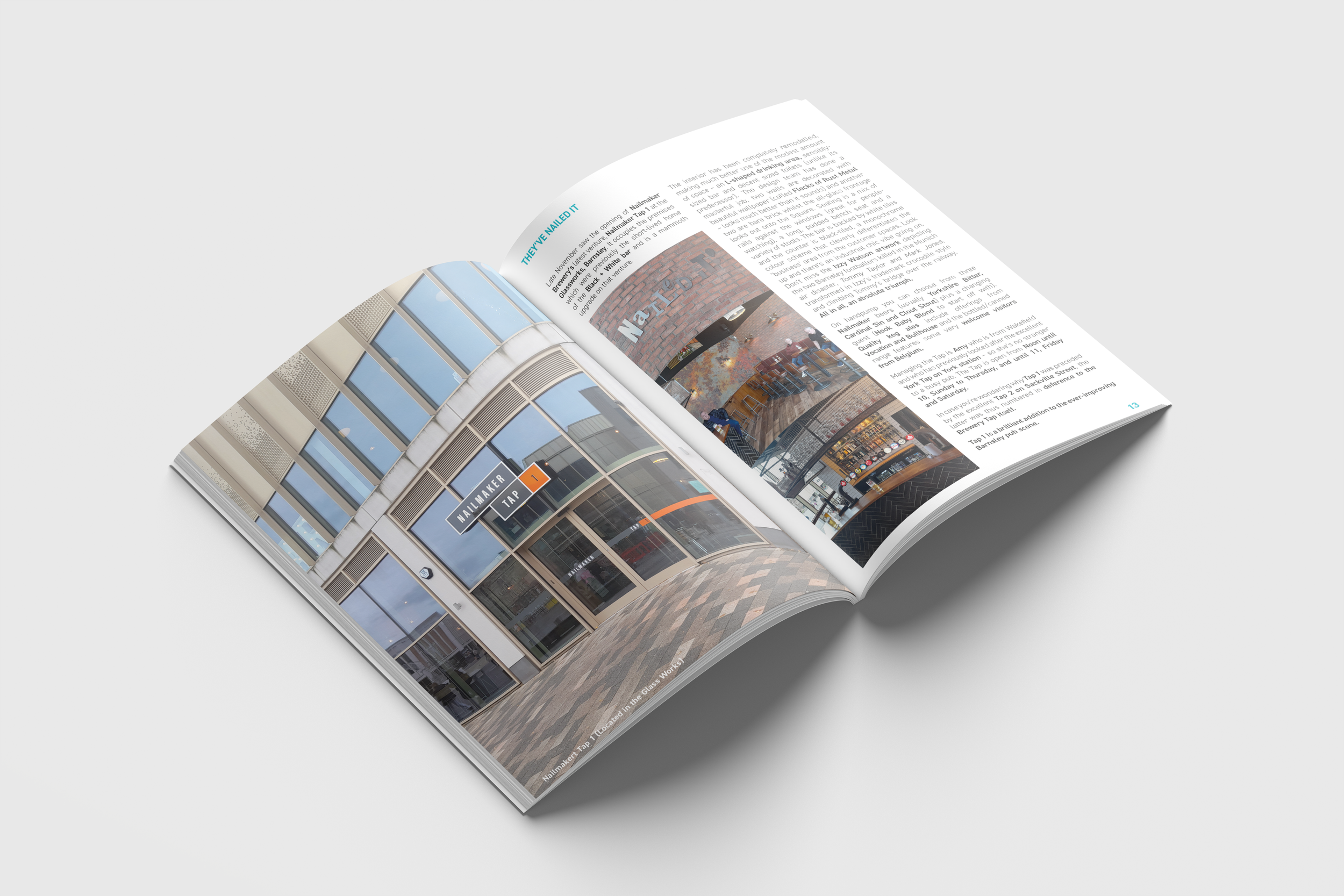
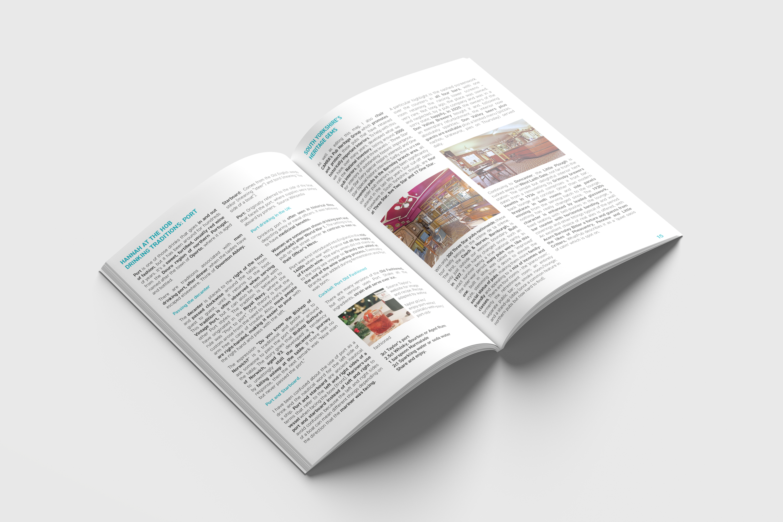
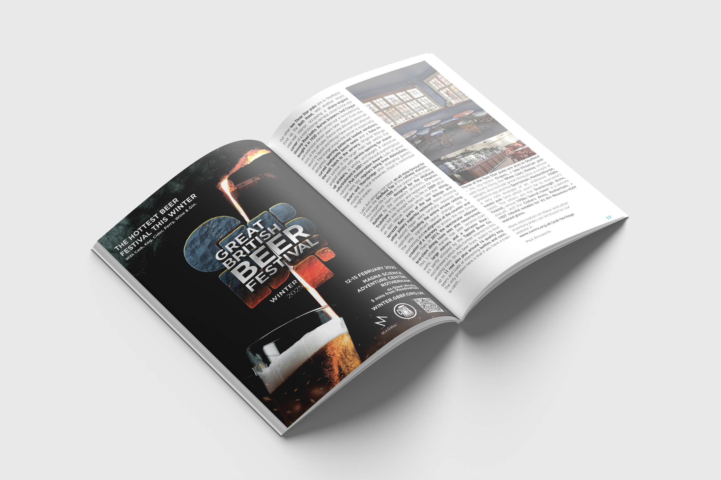
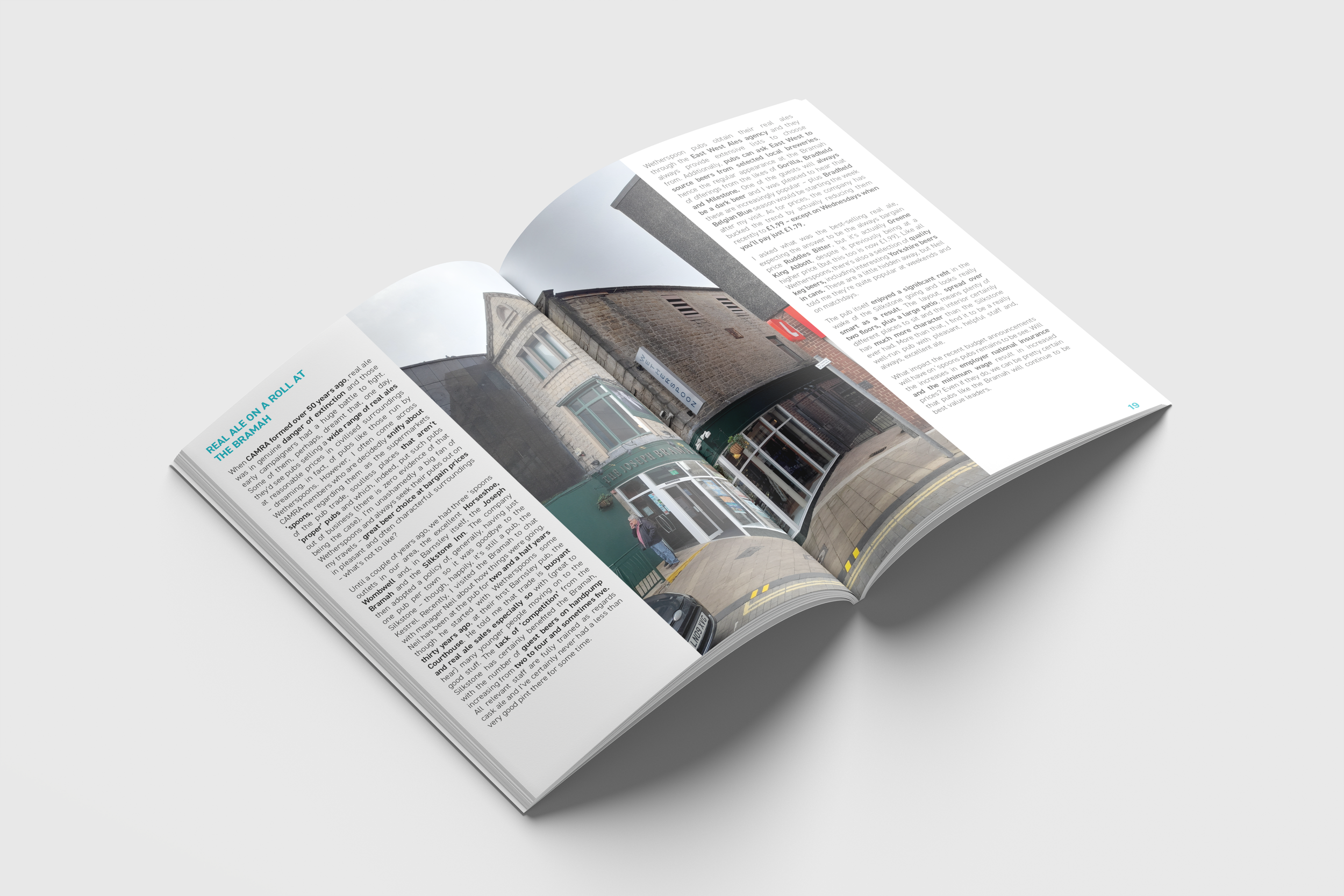
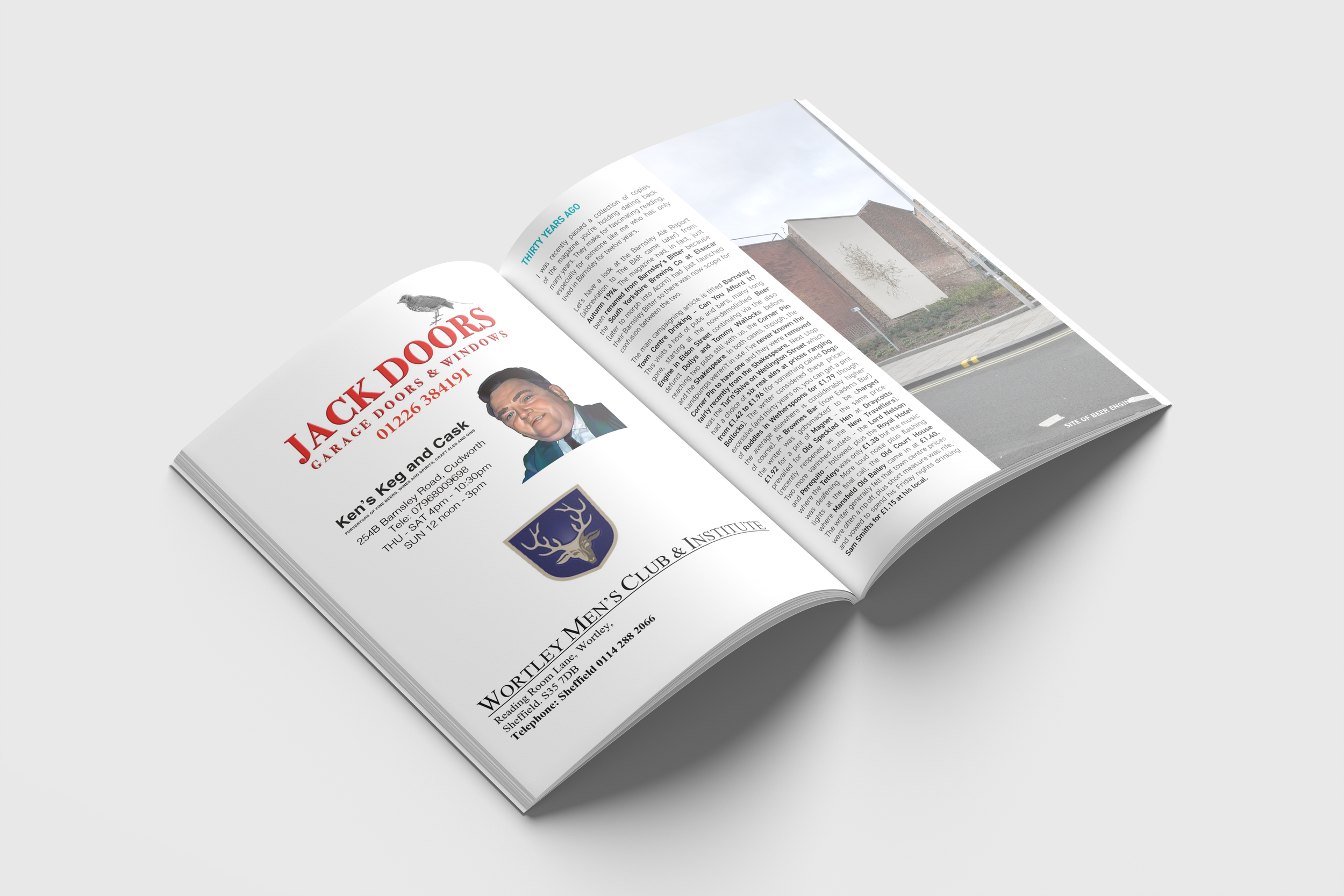
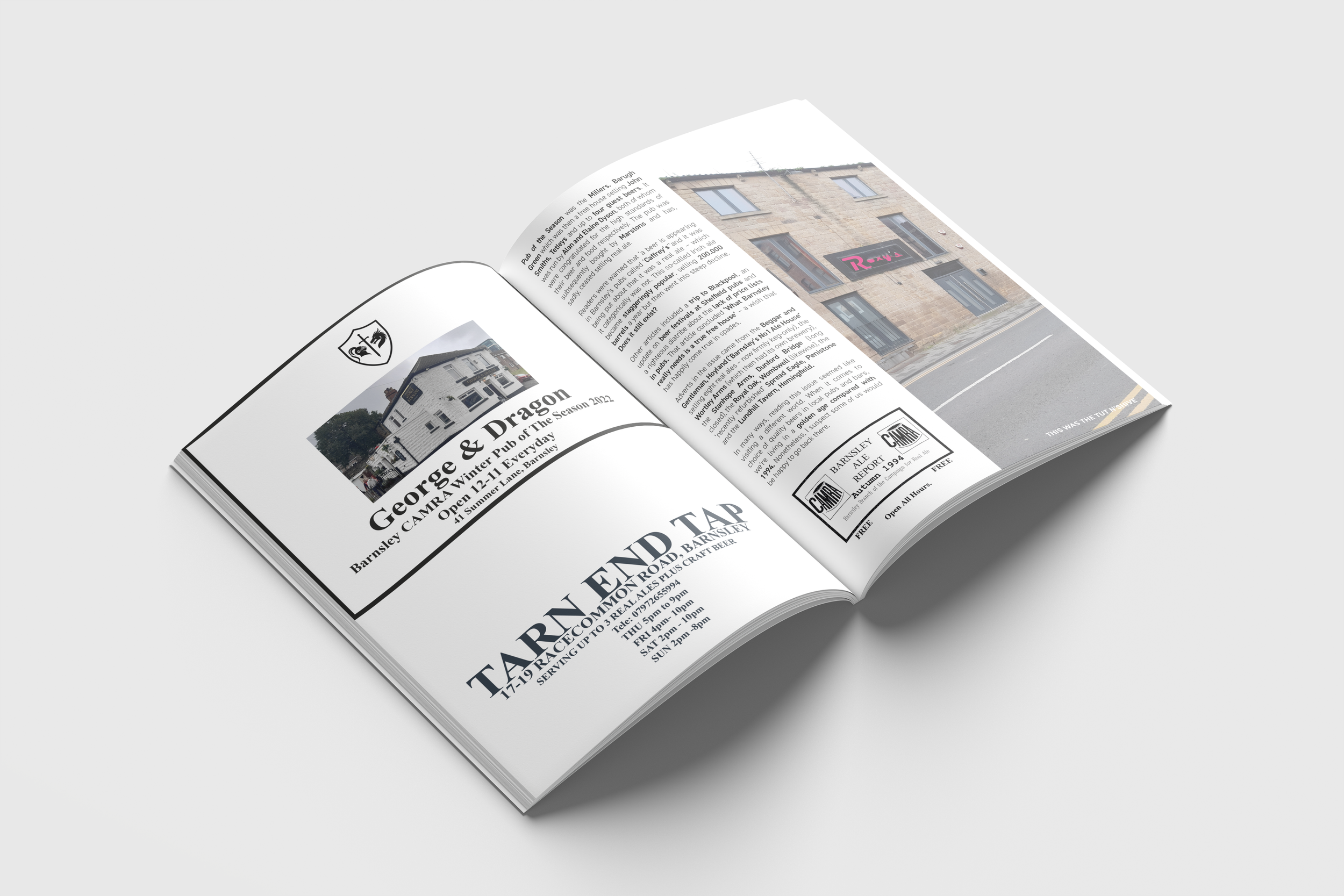
Barnsley Ale Report
Across five years of designing the Barnsley Ale branch magazine, I had the chance to continually refine and evolve its visual identity as both the publication and my own practice developed. Each issue became a space to explore new layouts, typographic systems, and editorial structures, allowing the magazine to mature visually while staying rooted in the character of Barnsley’s brewing community.
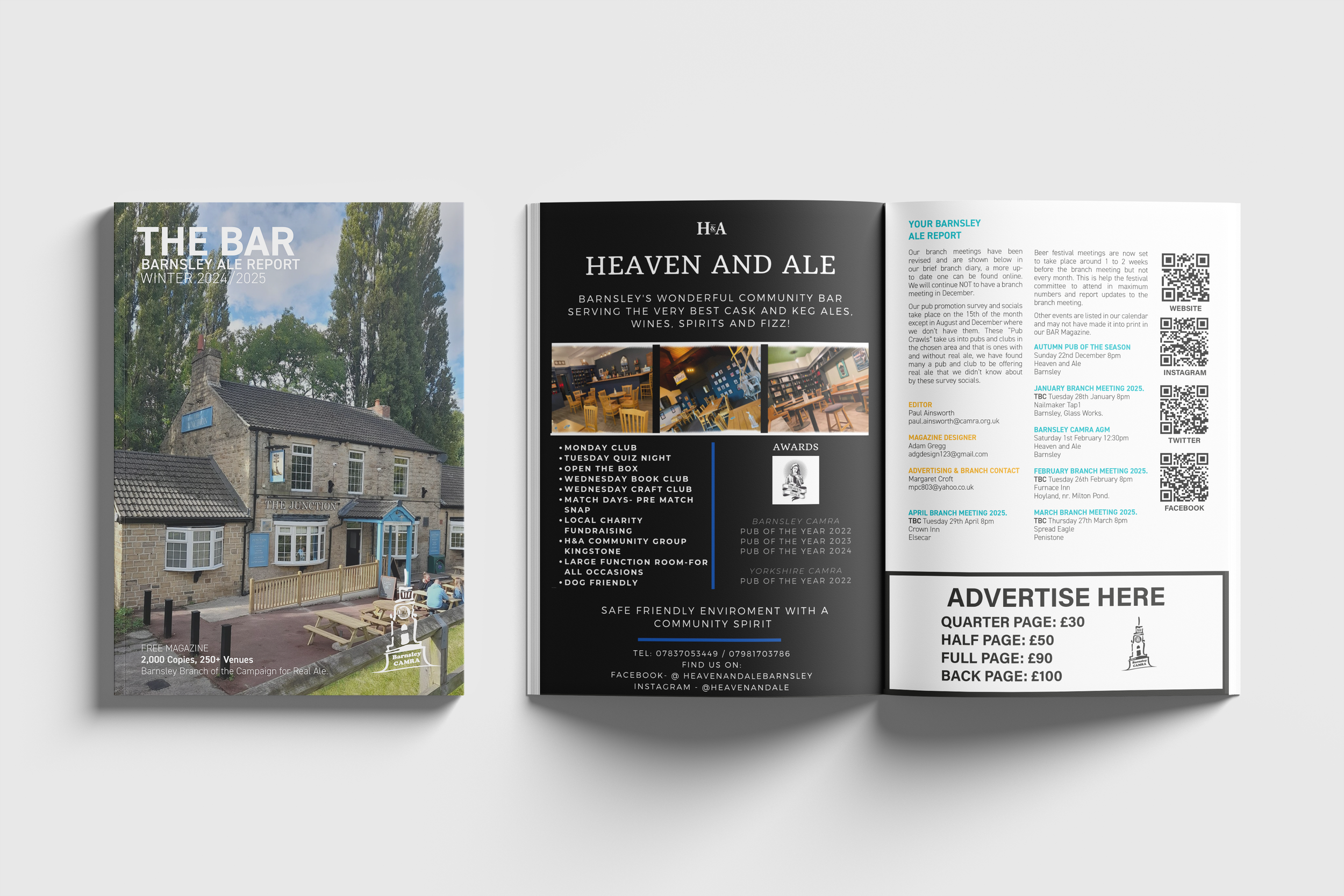
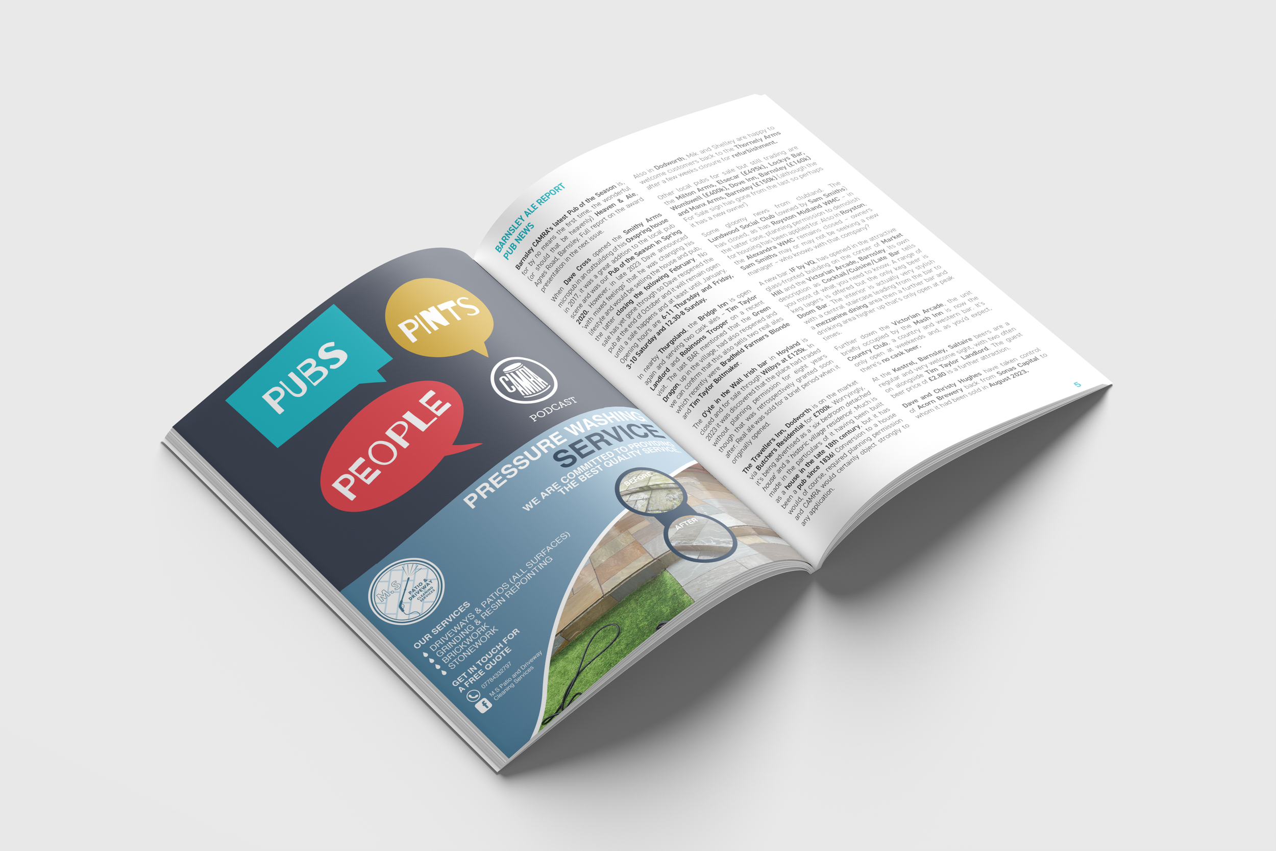
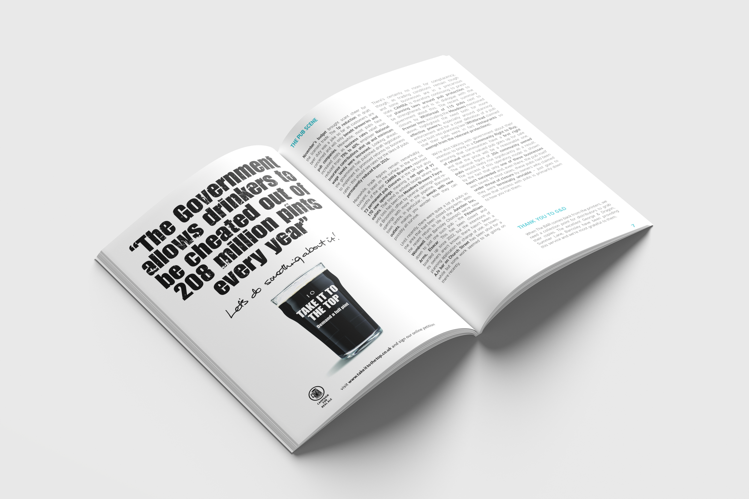
Early editions focused on establishing clarity and readability, ensuring the content was easy for members to navigate. As my skills and confidence grew, the design became more expressive — introducing stronger hierarchy, more contemporary layouts, and subtle shifts in branding that helped the magazine feel more cohesive and professional. These changes reflected not only the publication’s progression but also my own development as a designer.
Working on the magazine over such a sustained period gave me a unique opportunity to track my growth through real, recurring work. Each issue marked a new stage in my approach to editorial design, from early experimentation to more intentional, refined decision‑making. The result was a publication that evolved alongside me, becoming a long‑term project that strengthened both the branch’s identity and my own professional practice.