
Safe Check UK
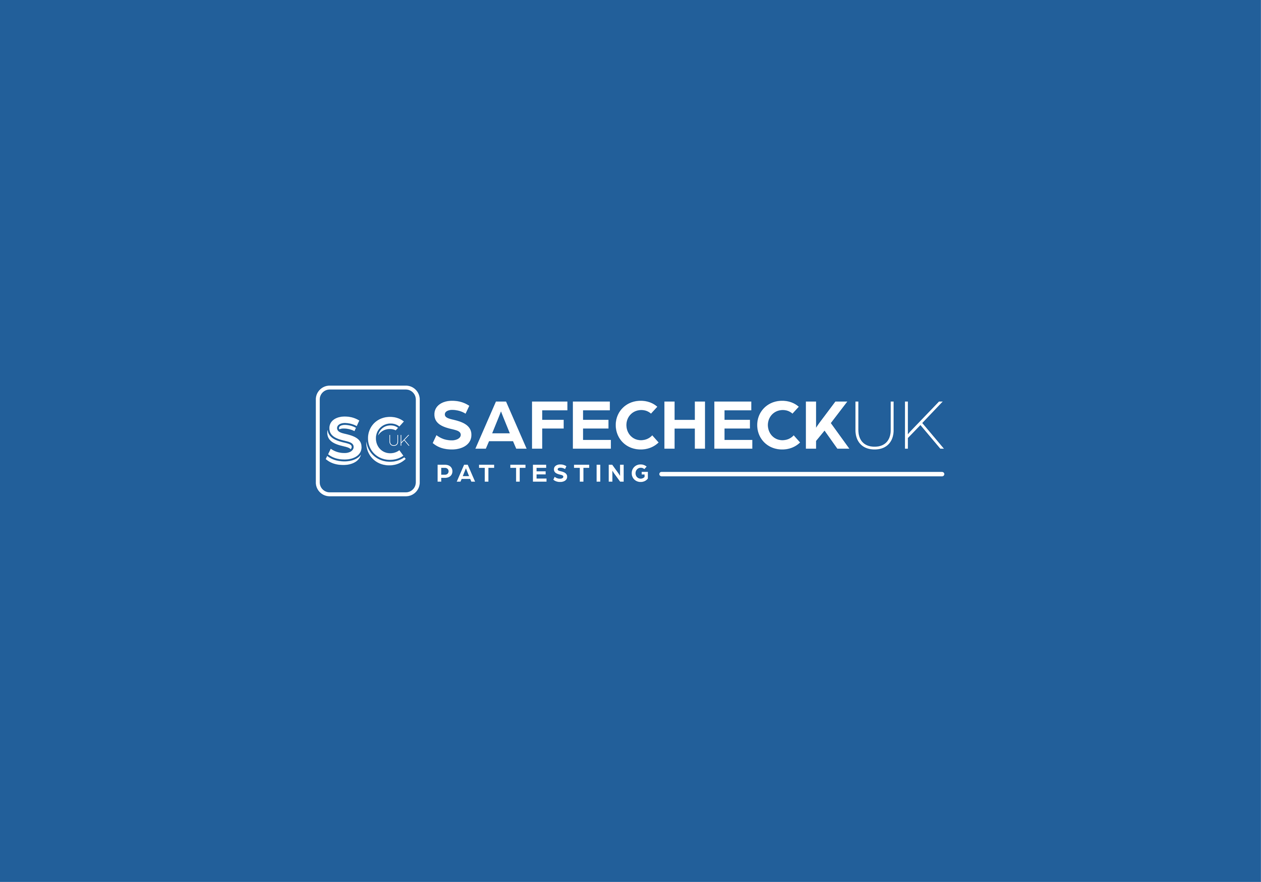
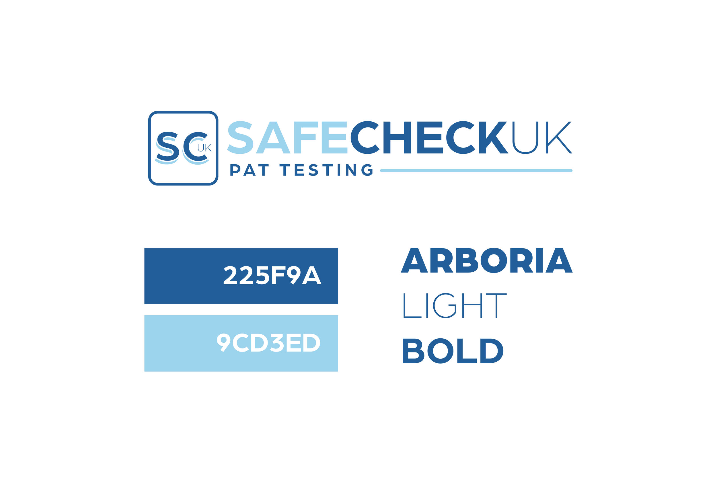
Alfie approached me looking for guidance as he began shaping the identity of his new business, Safe Check UK. He knew the service he wanted to offer, but the world of branding and websites felt unfamiliar, so the first step was helping him gain clarity on what his brand should represent. From our early conversations, it became clear that he wanted to avoid the typical clichés of the PAT testing industry — no green colour palettes, no generic plug icons, and nothing that felt like the standard off‑the‑shelf compliance branding.
With that in mind, I began exploring a typographic‑led direction, focusing on creating a logo that felt clean, confident, and modern. The aim was to build an identity that stood apart from competitors while still communicating trust and professionalism. Through multiple iterations, we refined the structure, spacing, and tone until the brand captured exactly what Alfie had envisioned: something distinctive, contemporary, and unmistakably his.
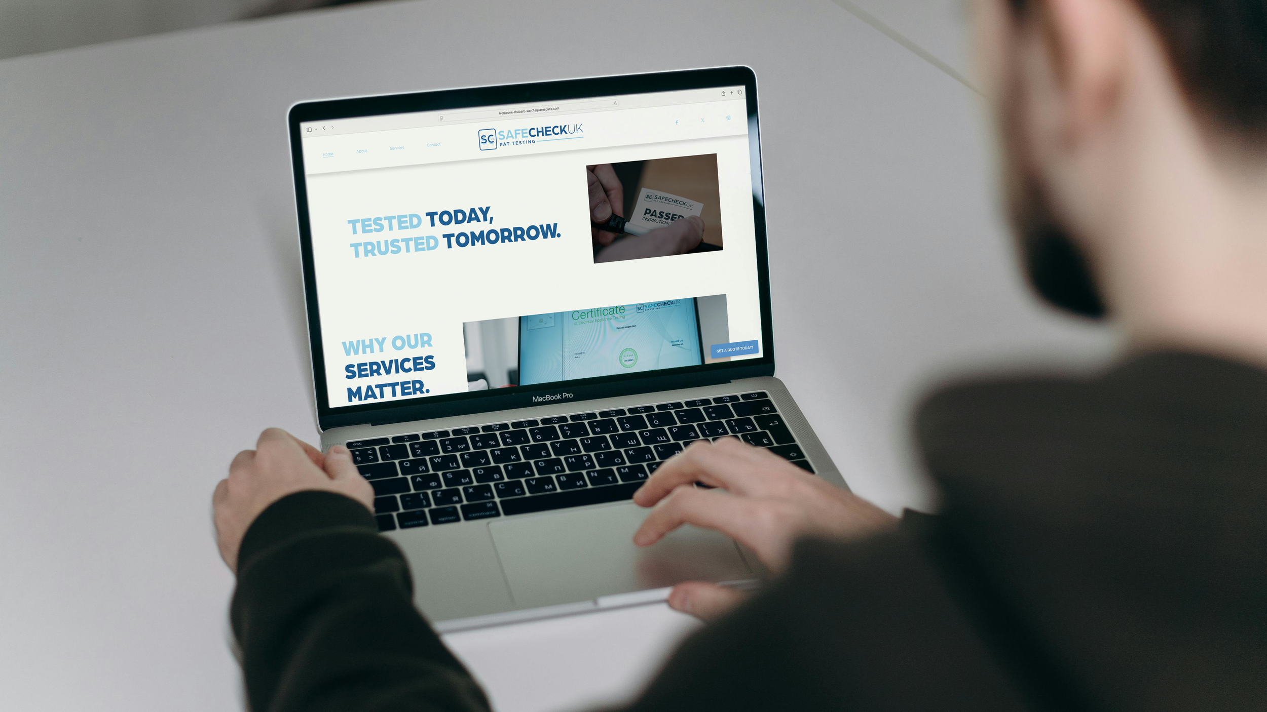
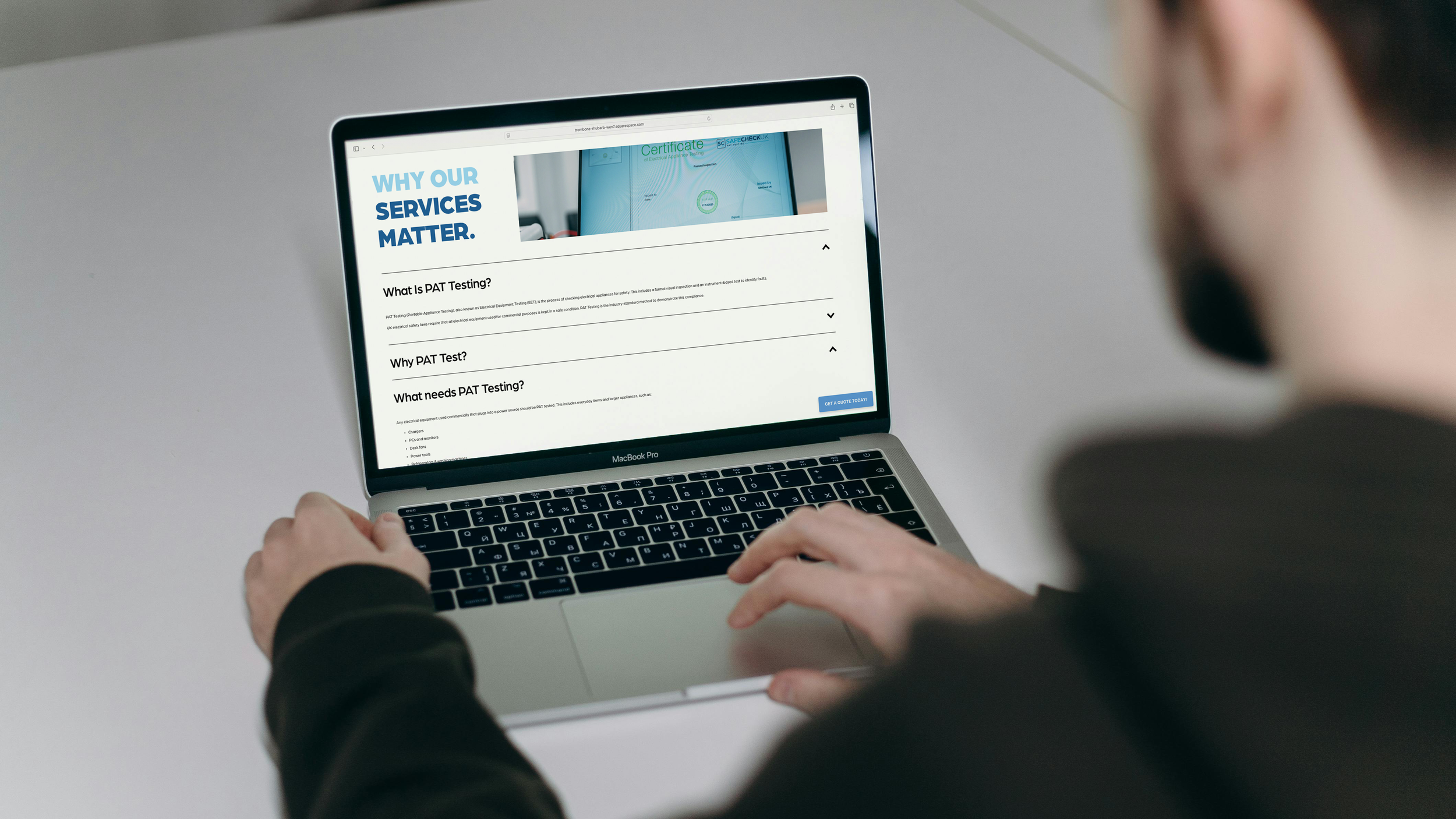
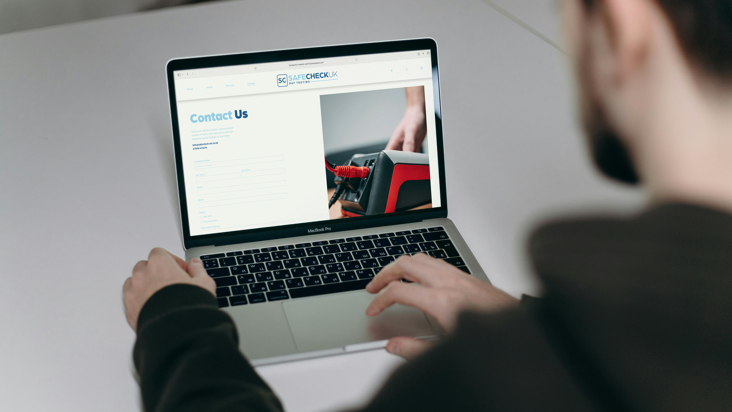
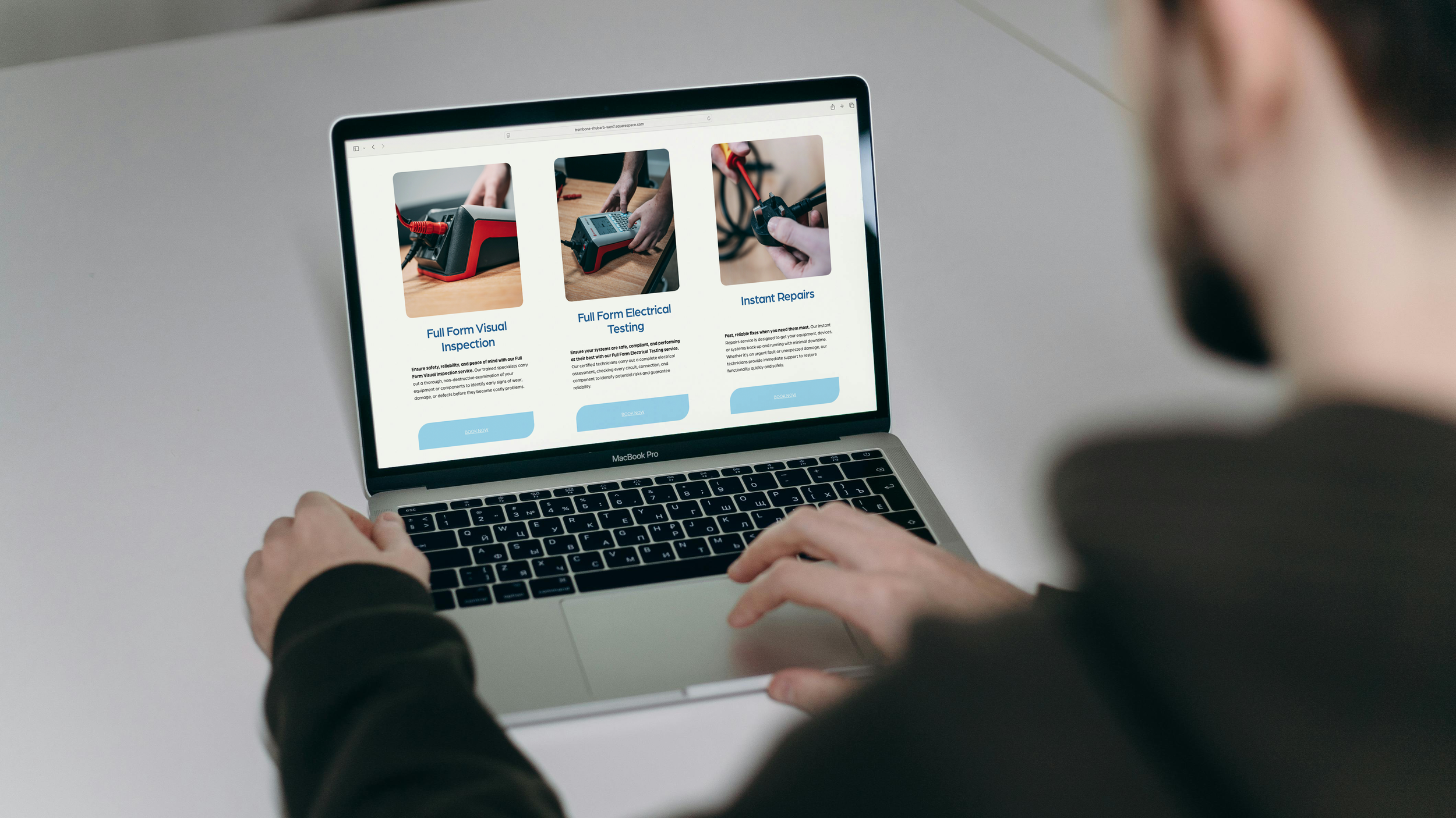
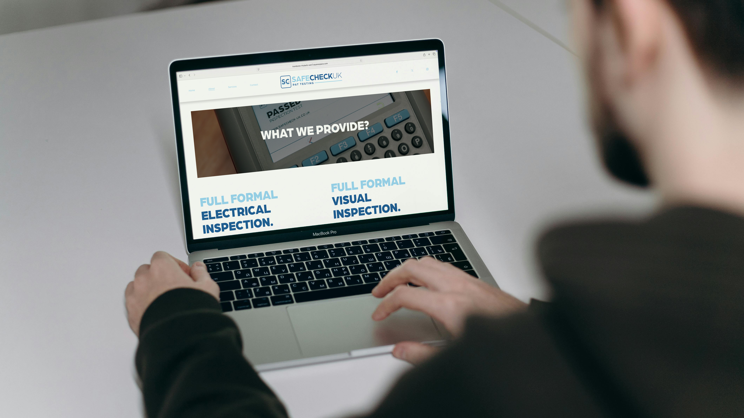
Once the branding was established, the next stage was developing the website. Alfie wanted something simple, direct, and user‑friendly — a site that prioritised key information and made it effortless for clients to get in touch. The result was a streamlined, conversion‑focused layout built around clear call‑to‑actions, accessible service details, and a structure that guides visitors from first click to enquiry with minimal friction.
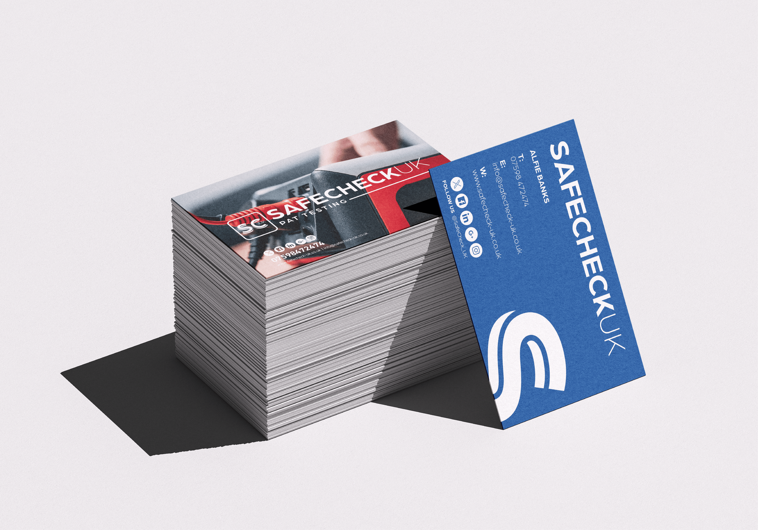
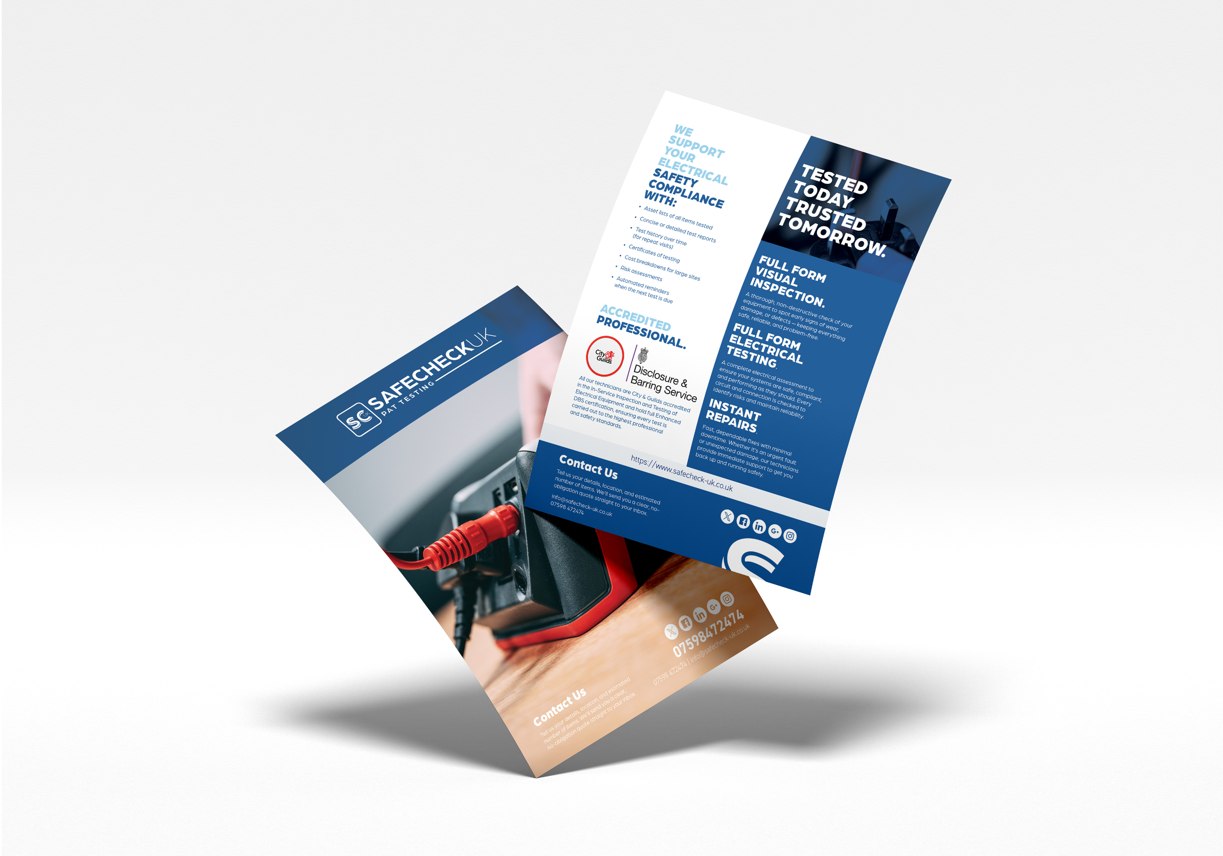
As the business grew, we expanded the visual identity across printed materials. Alfie had some excellent photography taken by UFO Media, which gave us strong assets to work with when producing flyers and business cards. These images helped elevate the brand further, giving Safe Check UK a polished, professional presence across both digital and physical touchpoints.
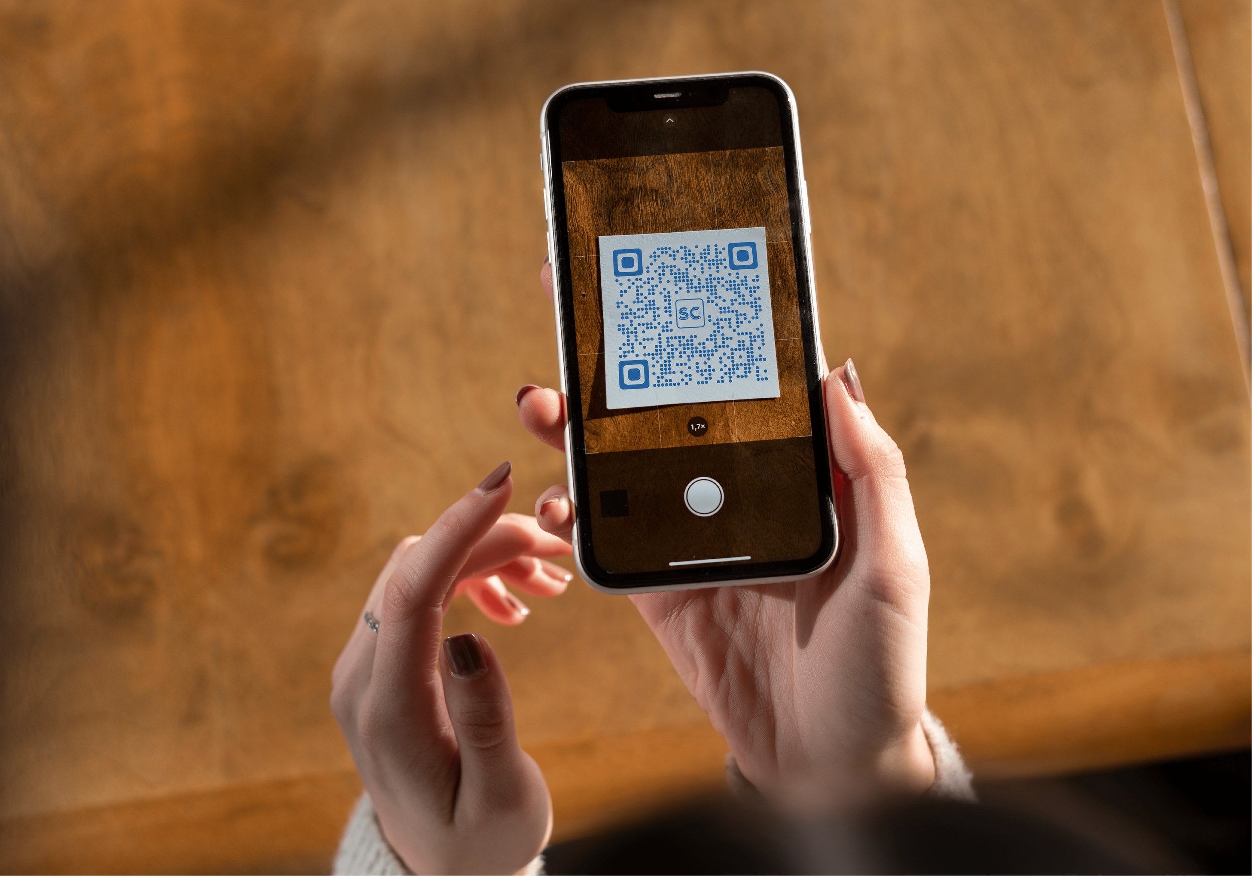
During the flyer development, Alfie mentioned wanting a recognisable and trustworthy QR code that could be used consistently across his marketing materials. This led to the creation of a custom icon that now forms the centrepiece of his QR code — a small but meaningful detail that reinforces the brand wherever it appears.
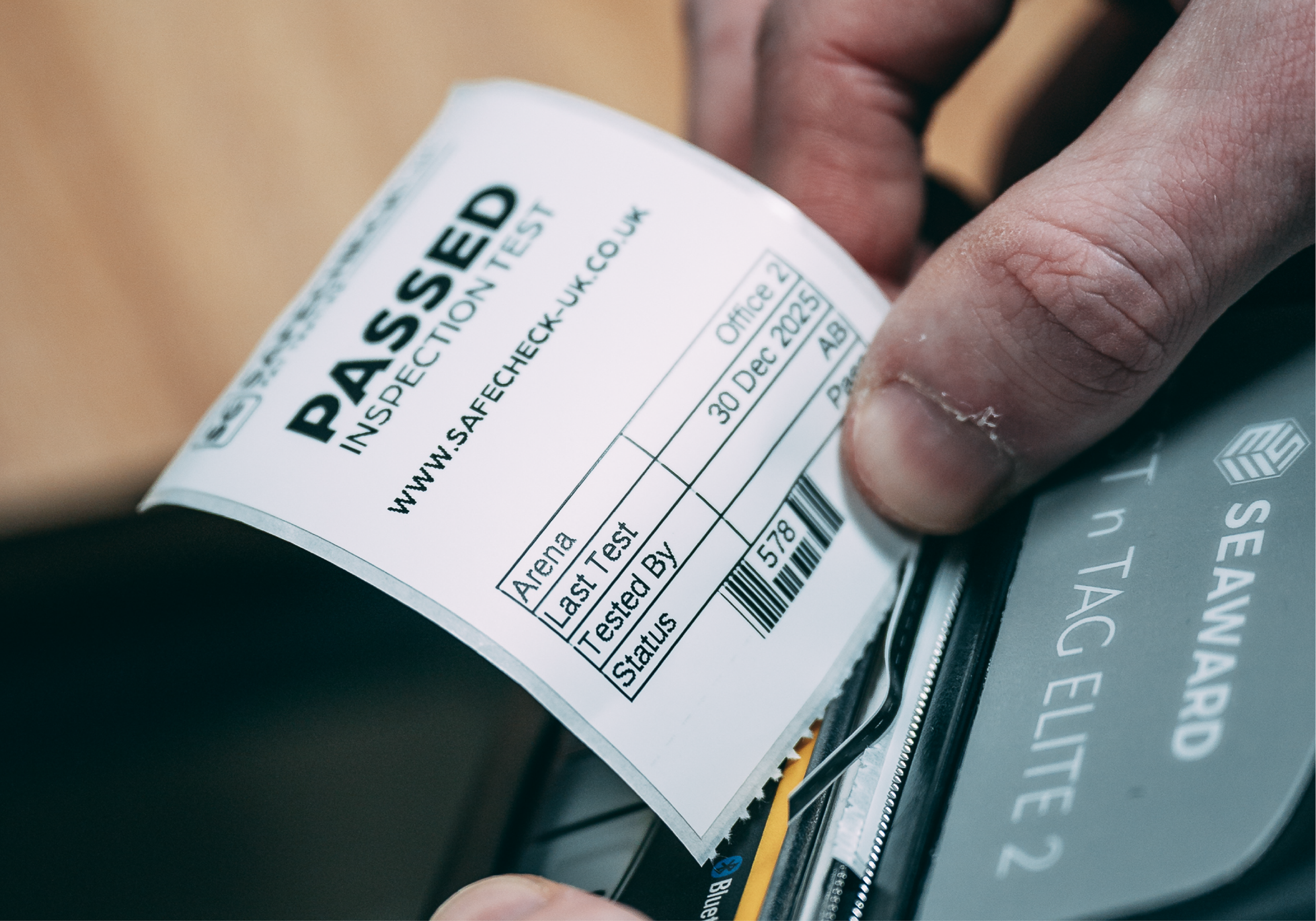
We also tackled a more technical challenge: creating pass and fail certificates for his testing machine. These needed to be produced in a 15kb BMP format to work with the device’s heat‑printing specifications. Alfie had been struggling with this, so I built the certificates from the ground up to meet the exact file requirements, ensuring they printed cleanly and reliably.
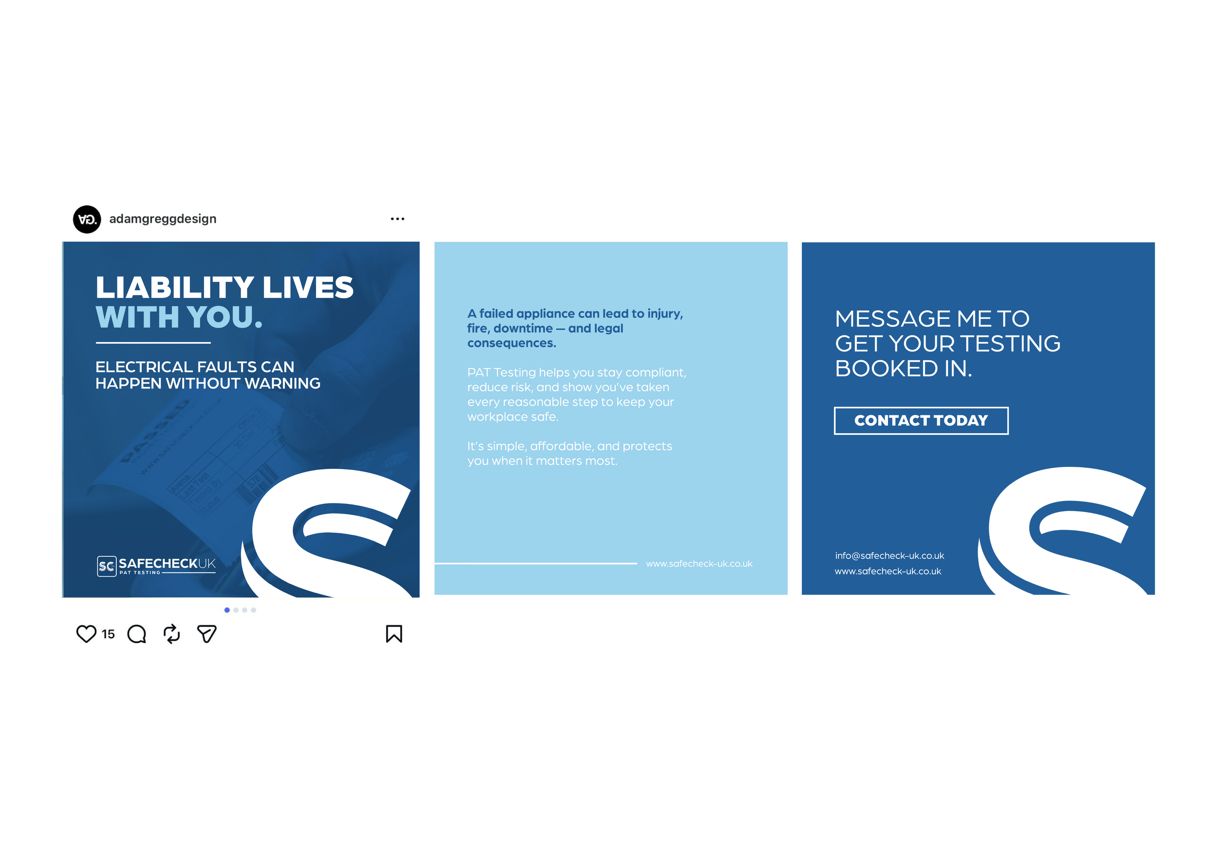
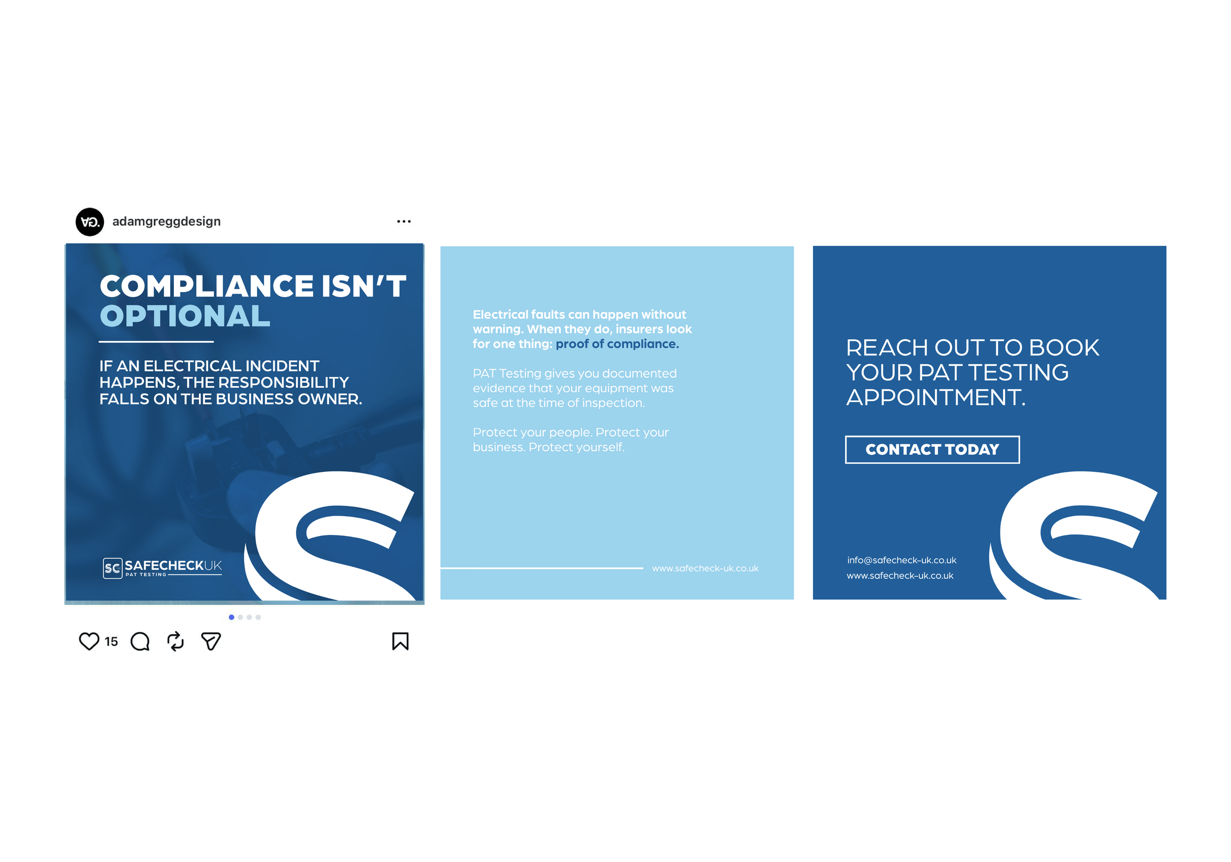
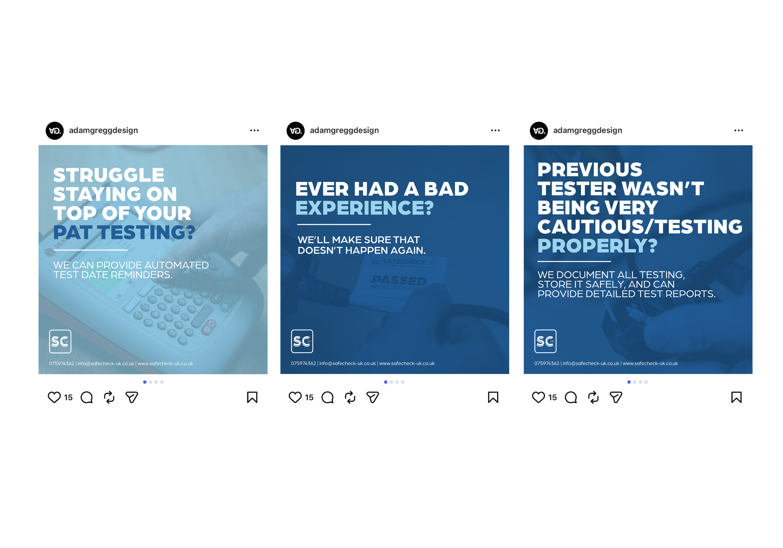
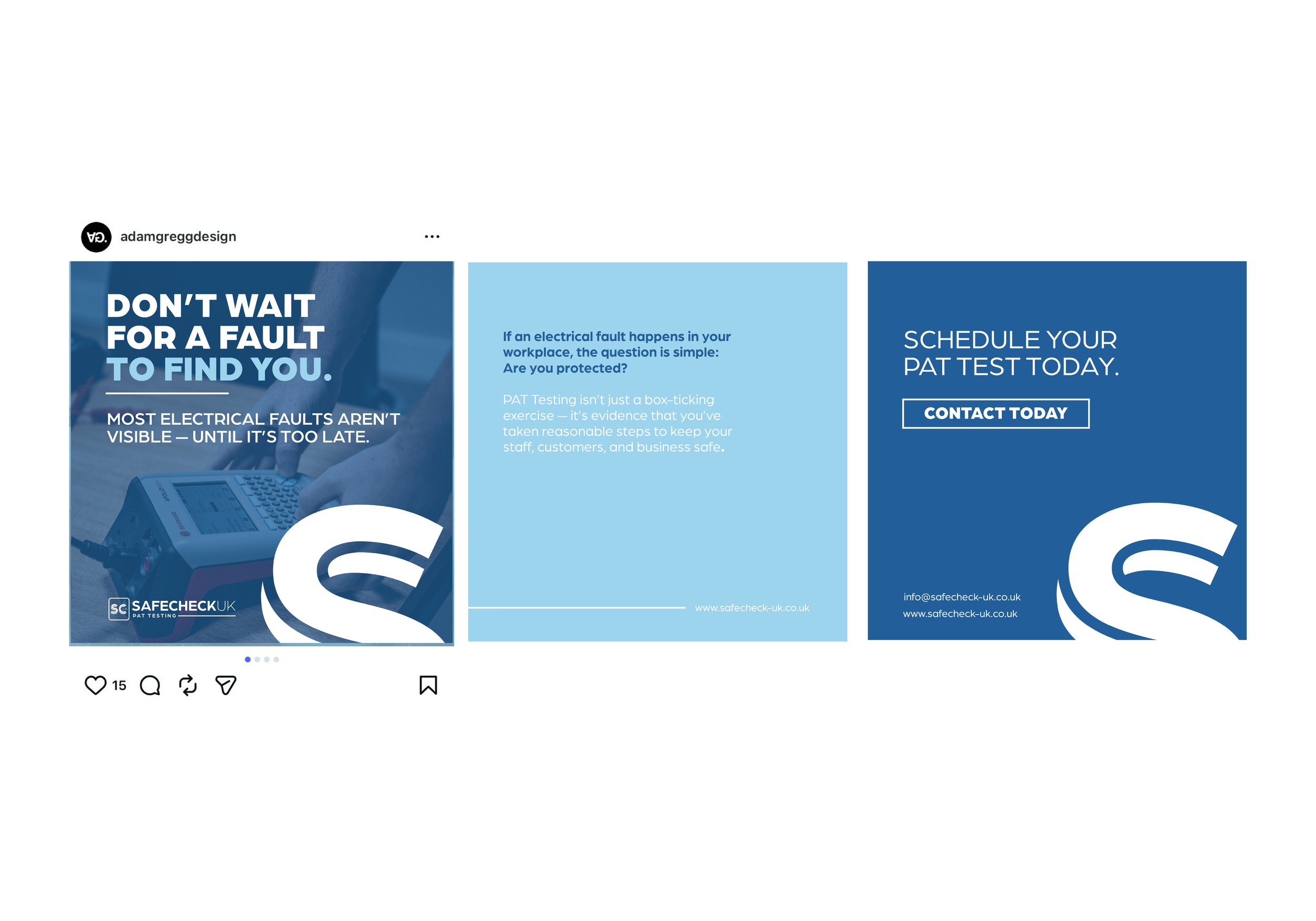
Later on, Alfie returned looking for support with marketing content and social media. Working within his budget, I recommended creating a set of carousel‑style Instagram posts — designs that could function individually or as a sequence, giving him reusable, long‑term assets that would help build awareness and consistency across his channels.


Who knows where Alfies branding and creative work will take him next. If you like this then don’t hesitate to contact me today and we can speak about the available options for your company and brand.