
White Cross +
White Cross + approached me with an existing identity they had created themselves when they first opened. With a new clinic launching in late 2025, they were ready for a complete rebrand supported by a full suite of updated stationery and marketing materials to reflect their new direction. The project centred on modernising their visual identity while retaining the core elements that represented their podiatry and chiropody services.
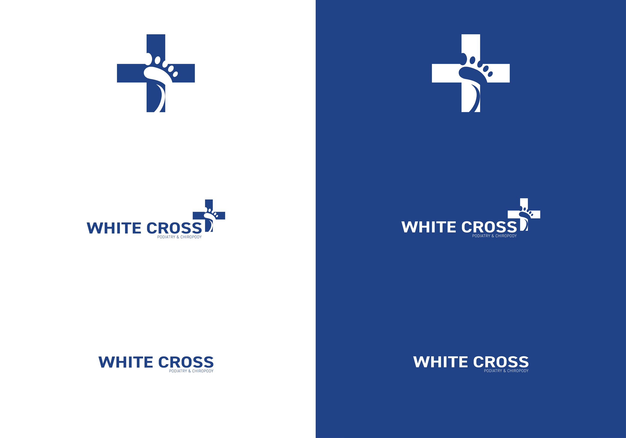
My concept development explored ways of refining the cross symbol and introducing a more contemporary nod to podiatry without relying on literal imagery. Through iteration, we moved away from merging the cross and foot icon directly, instead prioritising a cleaner, more professional visual style that felt welcoming to both existing and future clients.
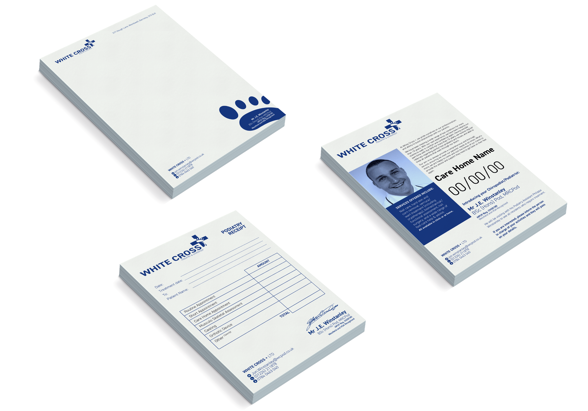
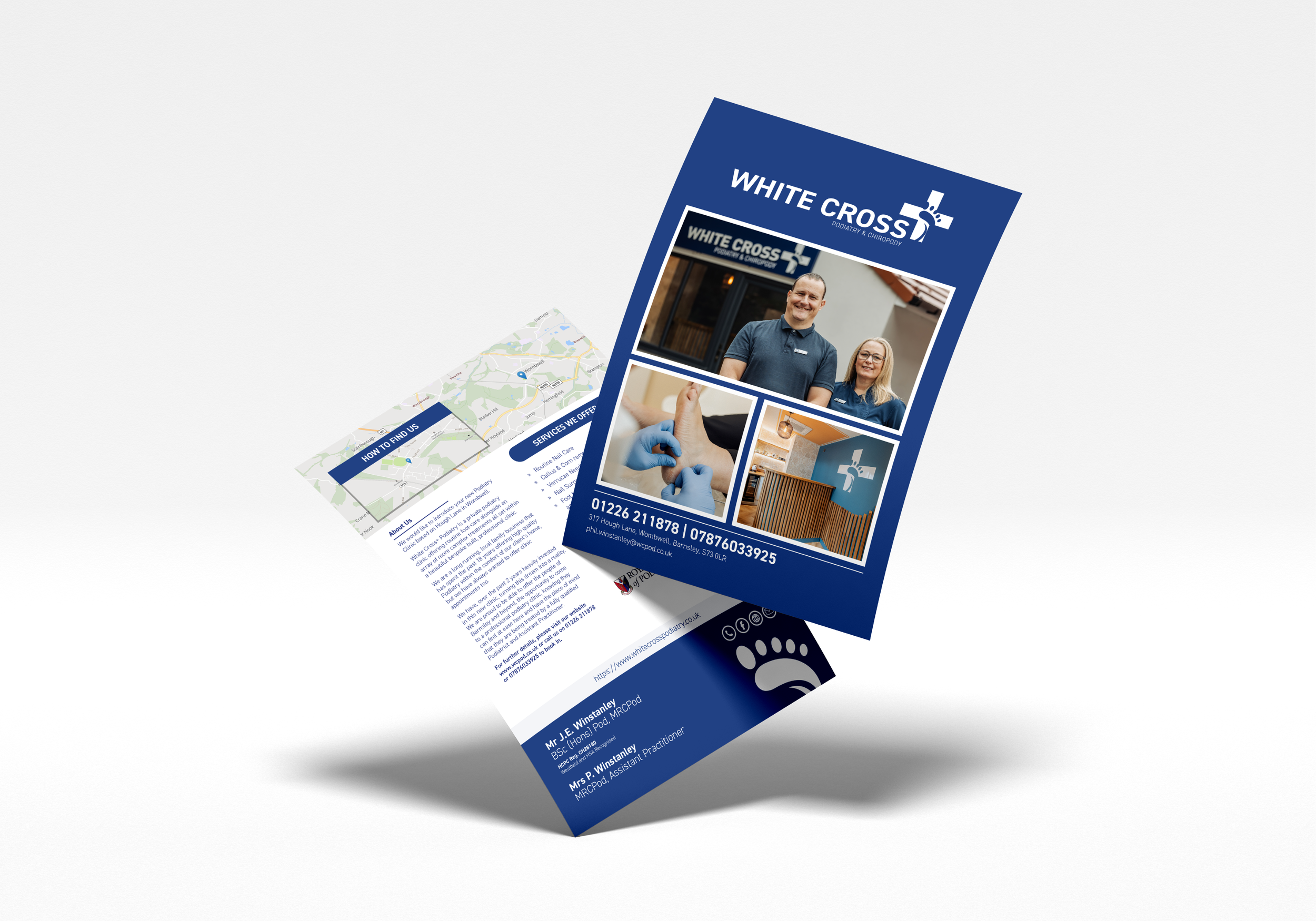
Once the identity was finalised, the brand was rolled out across a comprehensive set of printed materials, including business cards, appointment cards, compliment slips, letterheads, NCR invoice pads, and editable A4 posters for care homes. We also produced an opening flyer for the new clinic, incorporating updated visuals and more modern photography supplied by the client.