The N.S.O
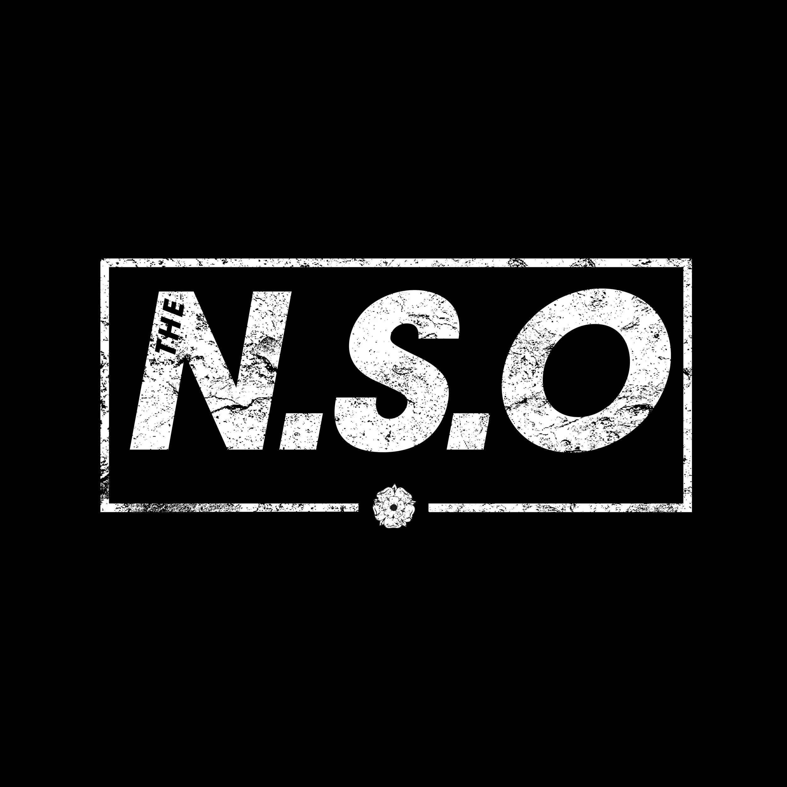
Jordan and Josh reached out looking to refresh their band’s identity ahead of a series of new releases they had planned. They already had a clear sense of direction, sharing early ideas and references, so the project began with shaping a logo that could work seamlessly across posters, line‑ups, social graphics, and future merchandise. One of the key requirements from the outset was ensuring the branding read “The N.S.O” in full — avoiding the common shorthand “NSO,” which often caused confusion.
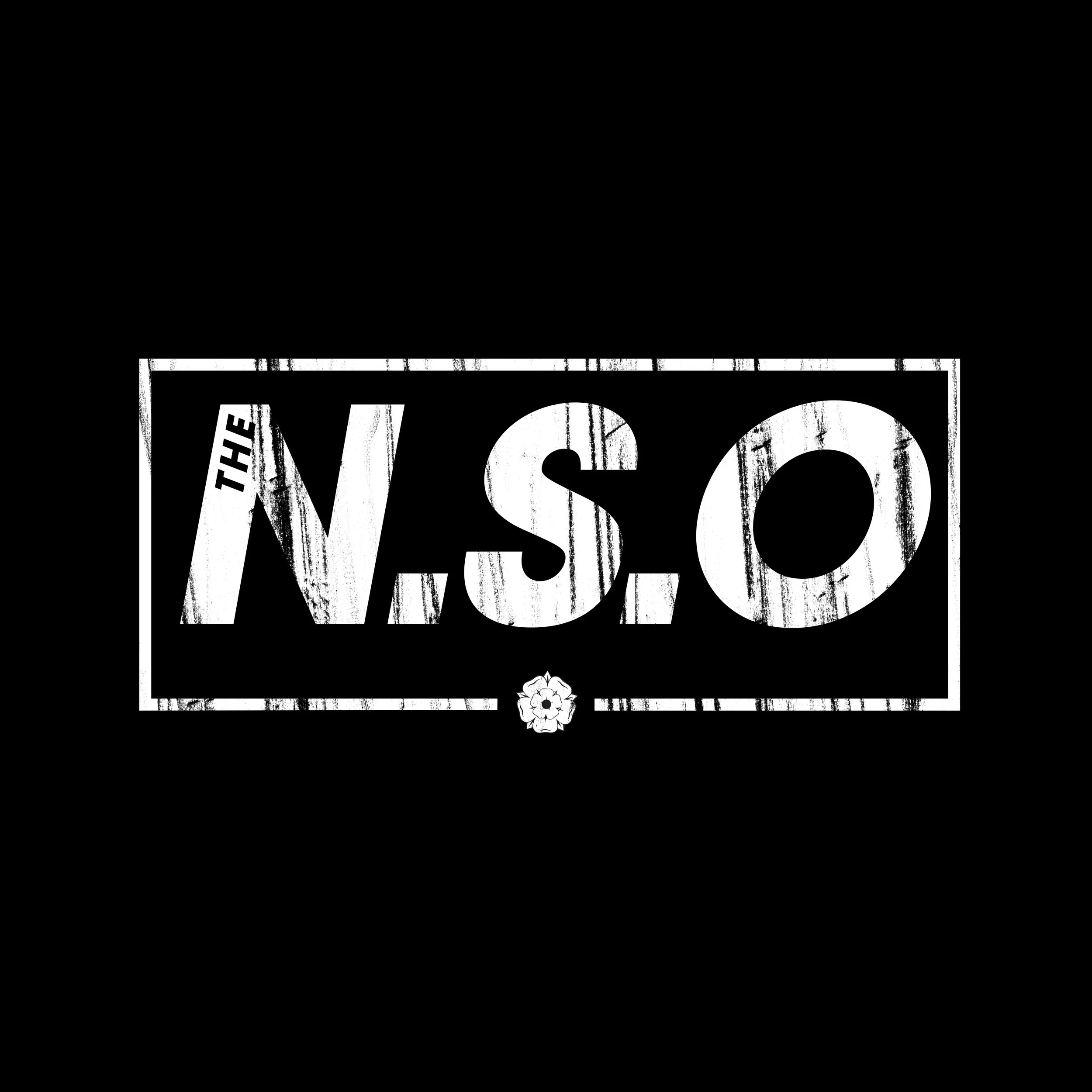
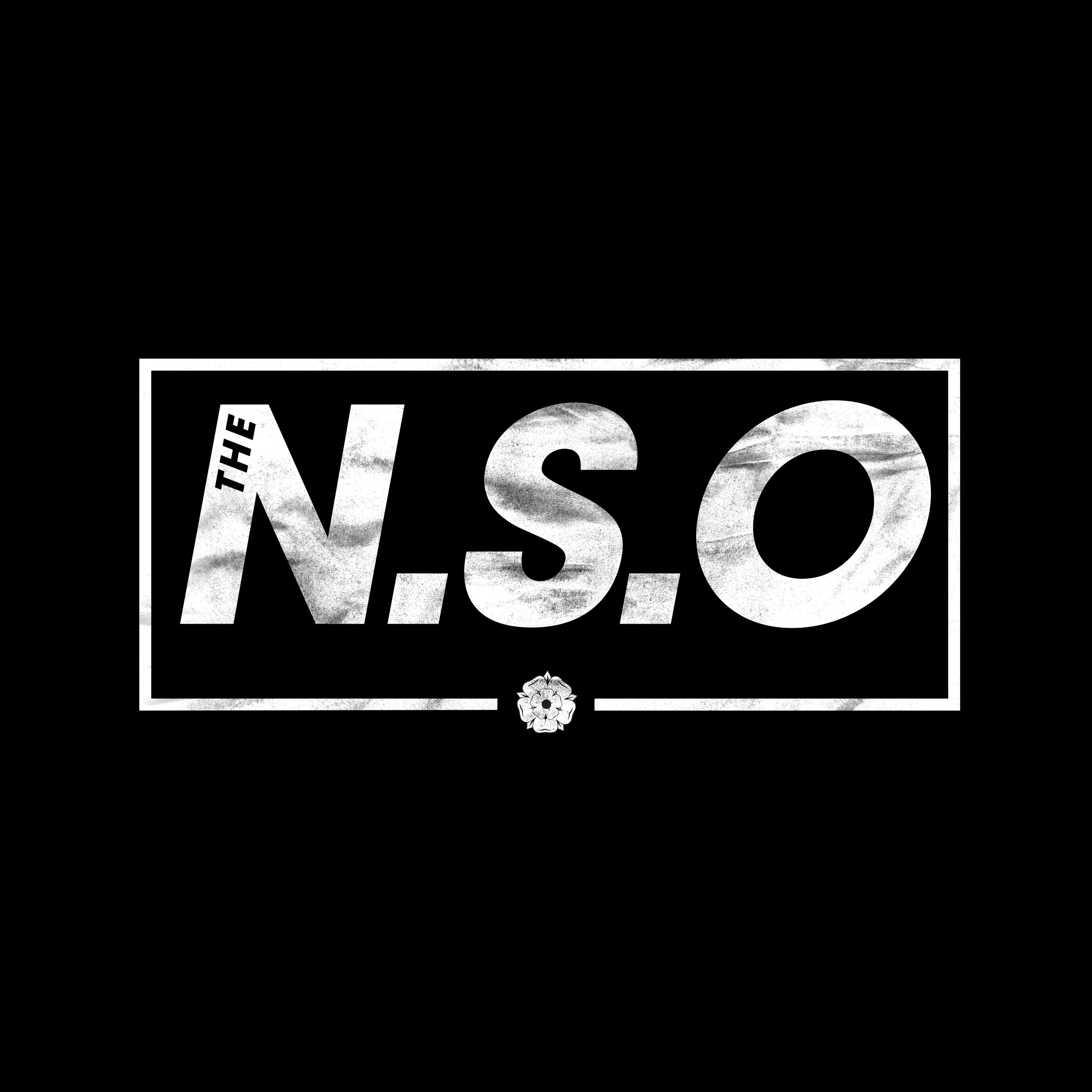
The initial concepts captured the structure they were aiming for, but the early versions felt a little too clean for the tone of their upcoming material. To bring the identity closer to the sound and aesthetic of their new EP, I introduced texture, grit, and a more distressed character to the logo. This added the edge and attitude they were looking for, giving the mark a stronger presence across their promotional assets.
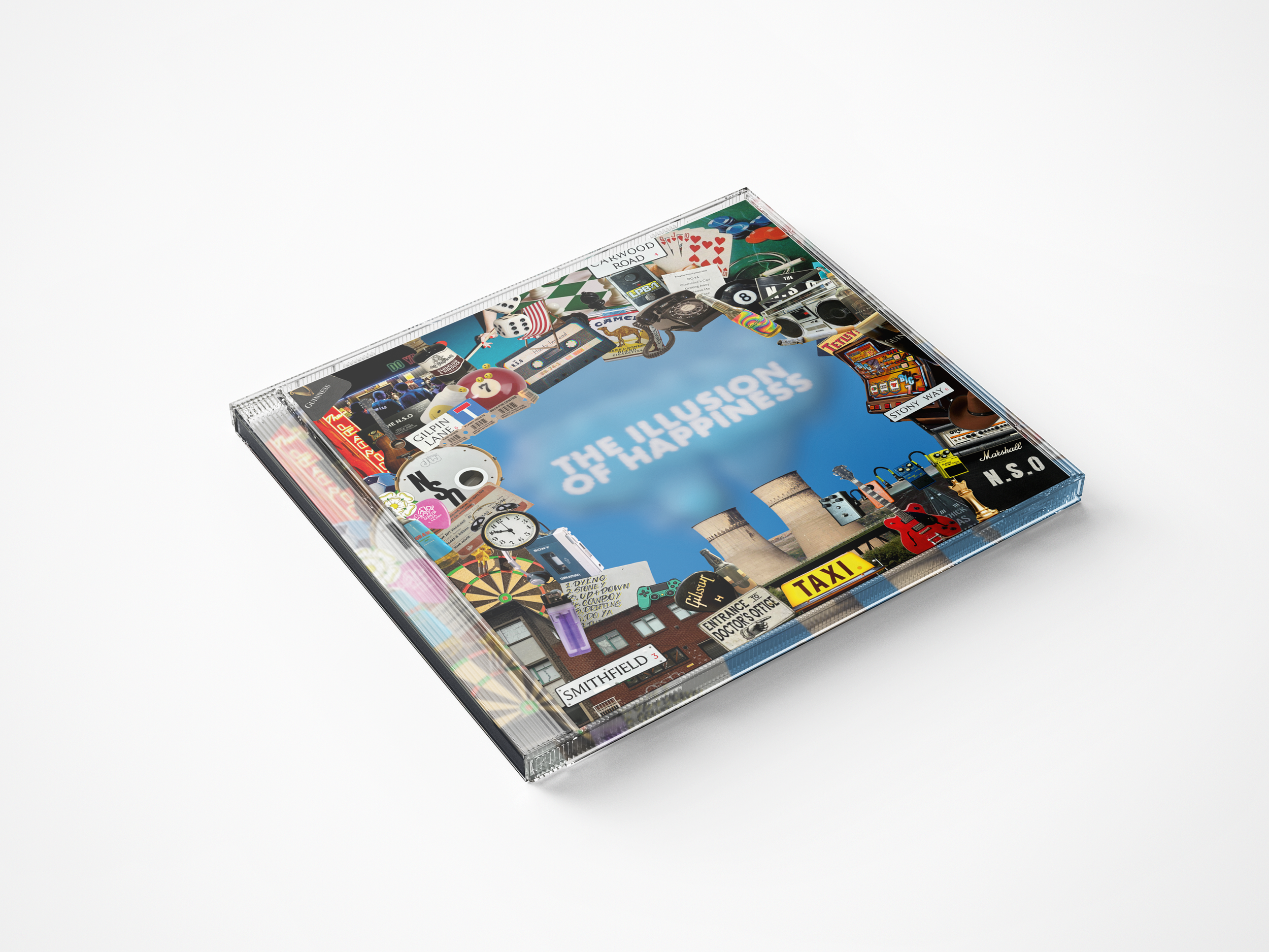
Alongside the logo, I was also asked to support the development of the EP artwork. The band had already begun working with another designer, who had created the surrounding collage, but they wanted the album title integrated into the fumes rising from the power station. After some detailed work in Photoshop, the typography was blended into the artwork in a way that felt natural and atmospheric, helping the cover achieve the mood and narrative they had envisioned.
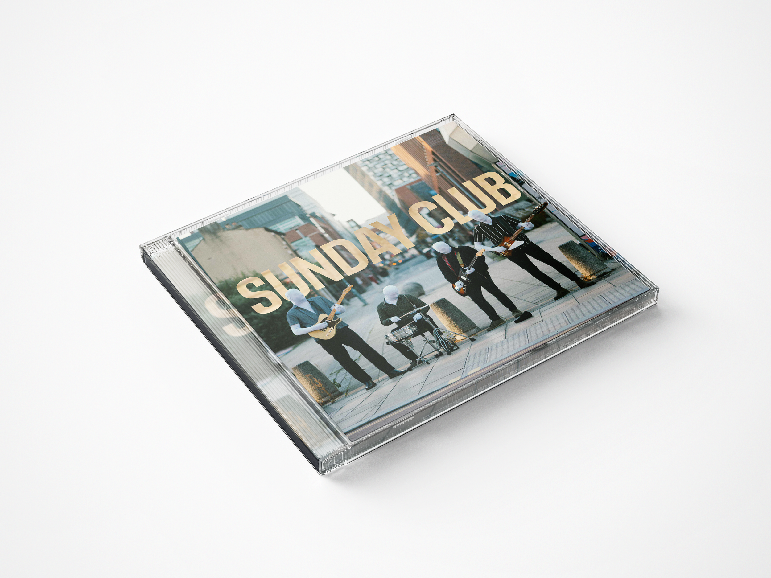
The single artwork followed a similar process. Jordan and Josh had a strong idea of what they wanted and had already explored some early drafts. With a few refinements and adjustments, the final design came together smoothly — aligning with the wider visual direction while giving the single its own identity.